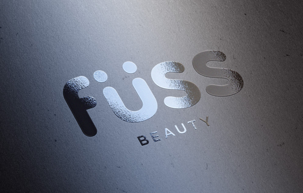
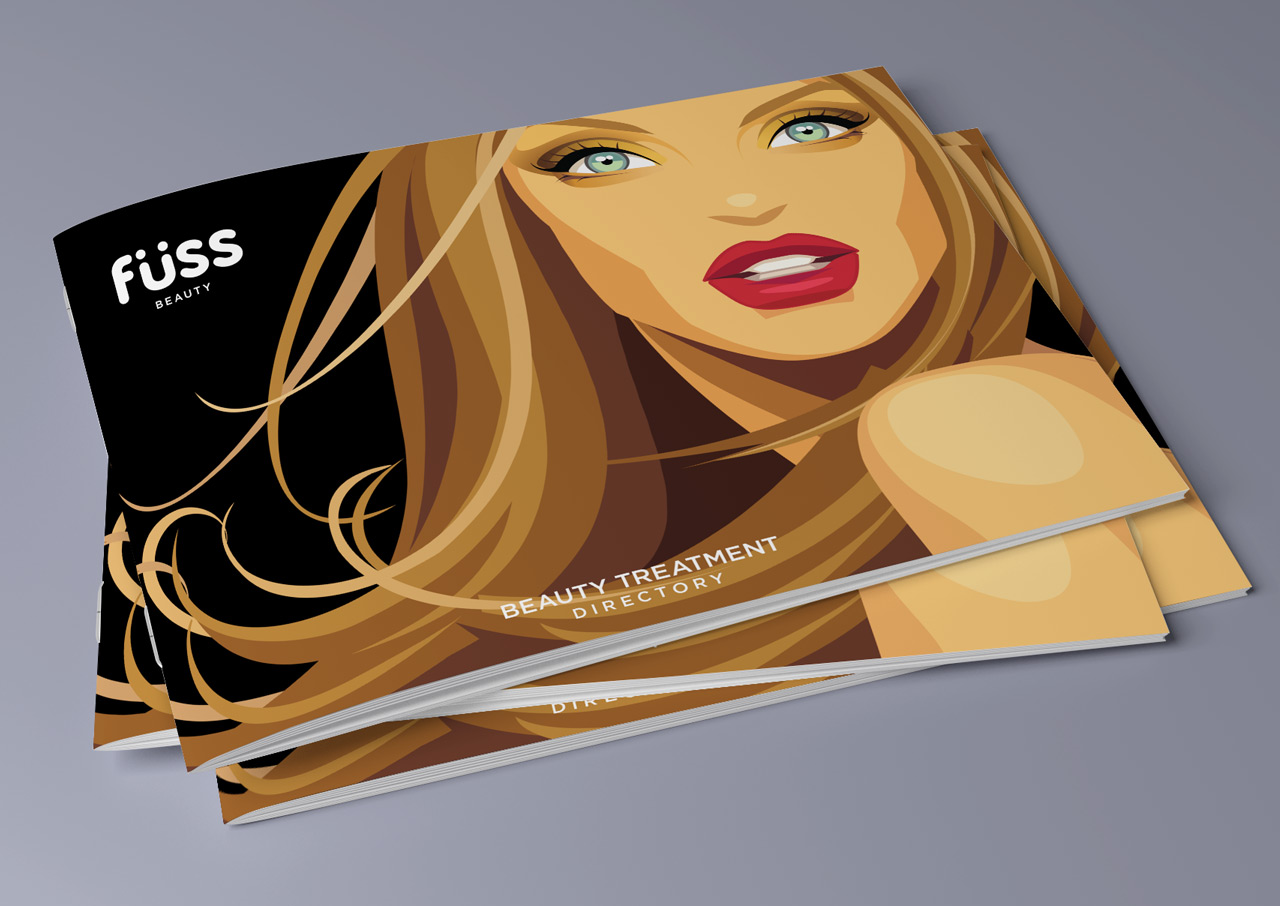
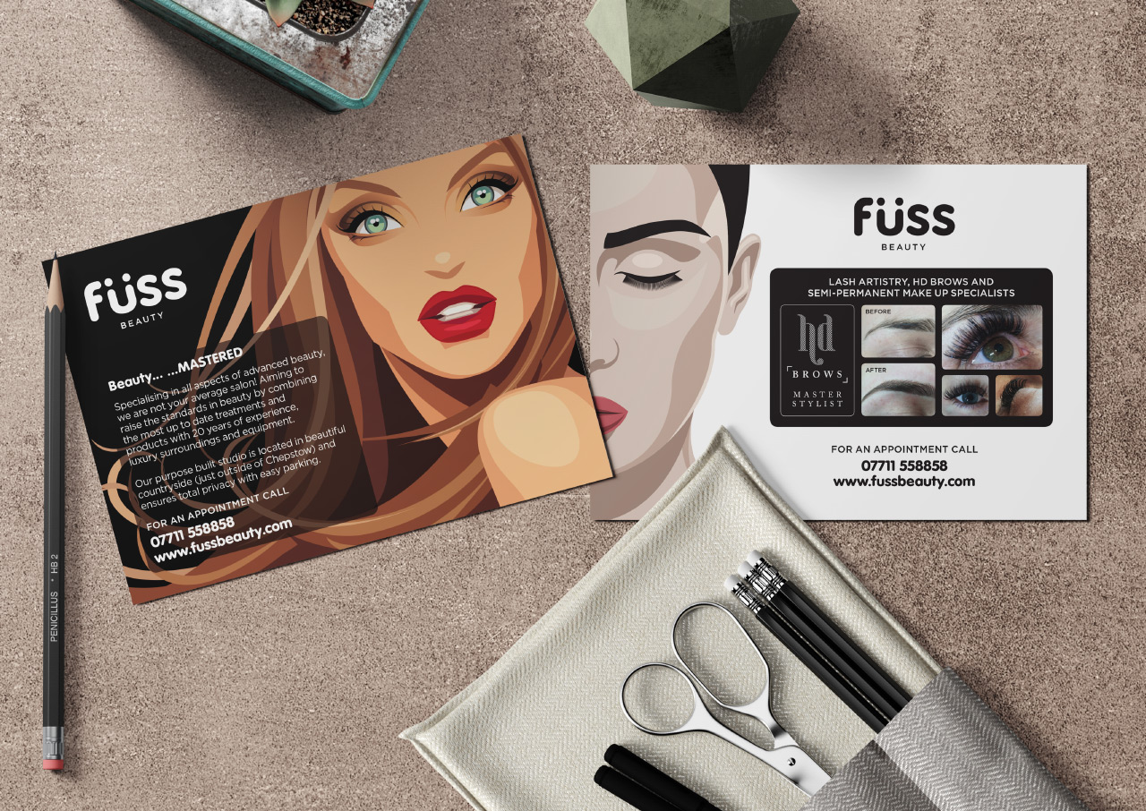
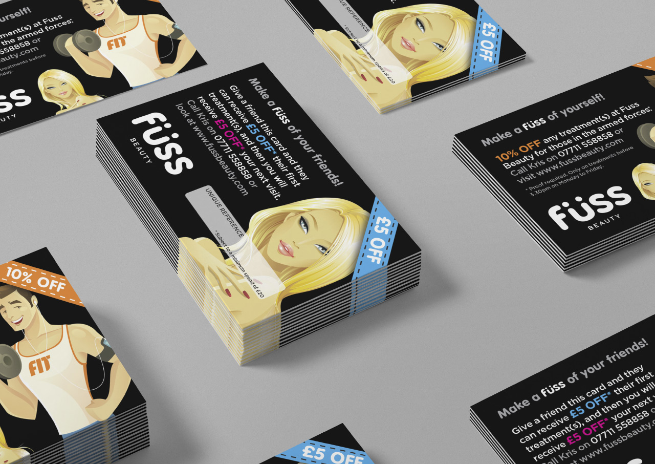
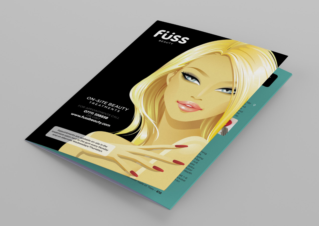
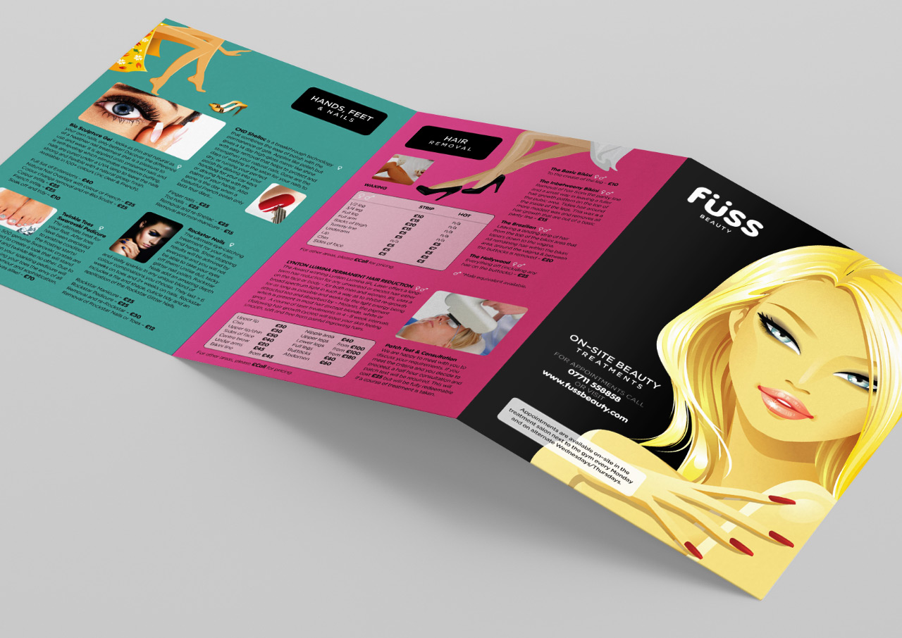
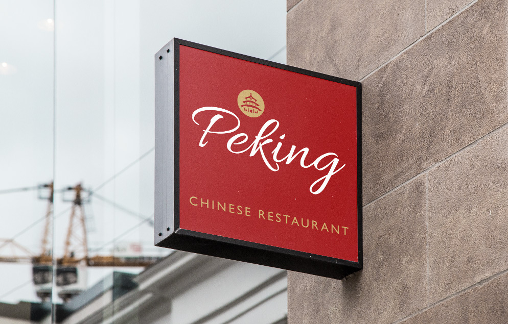
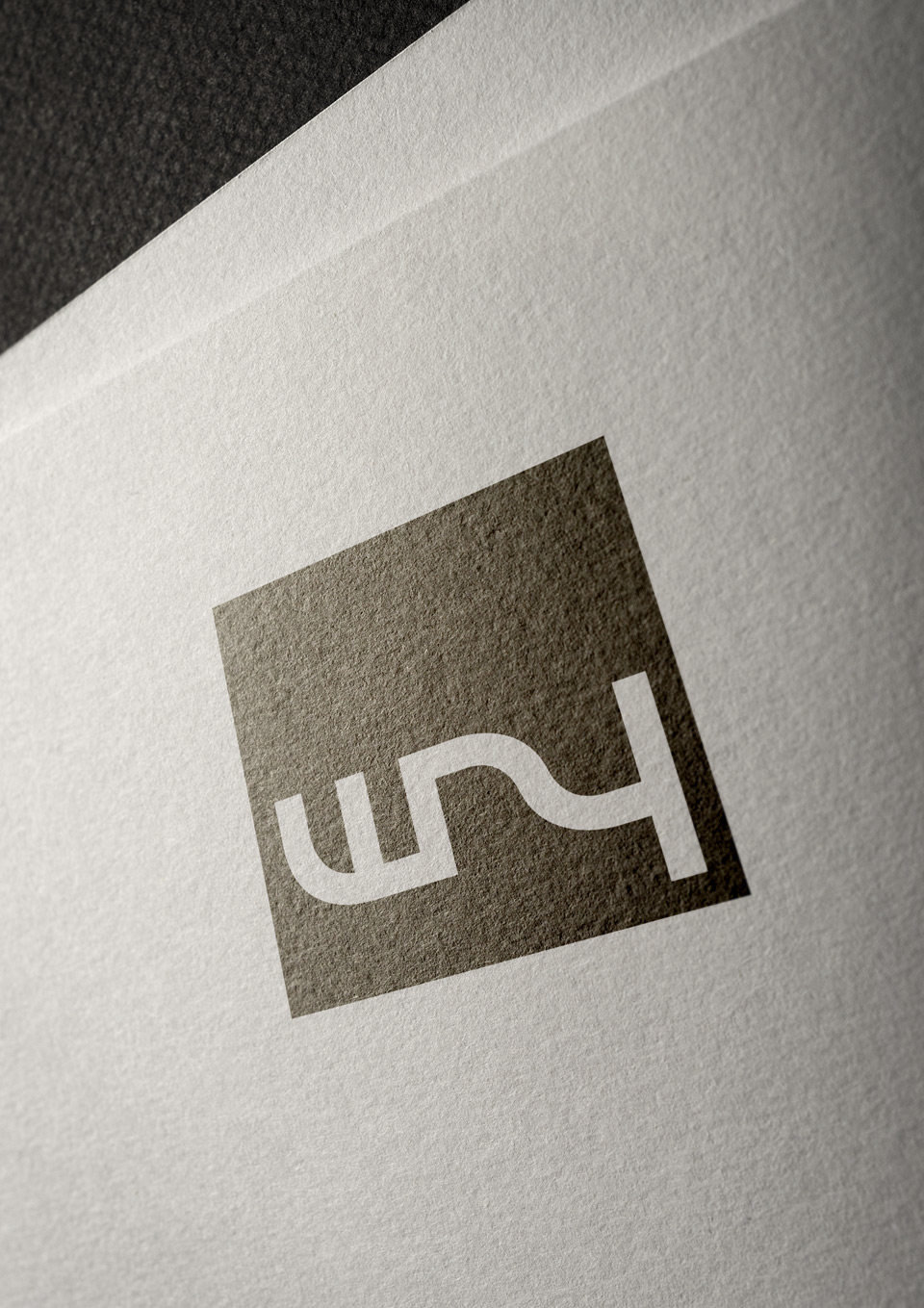
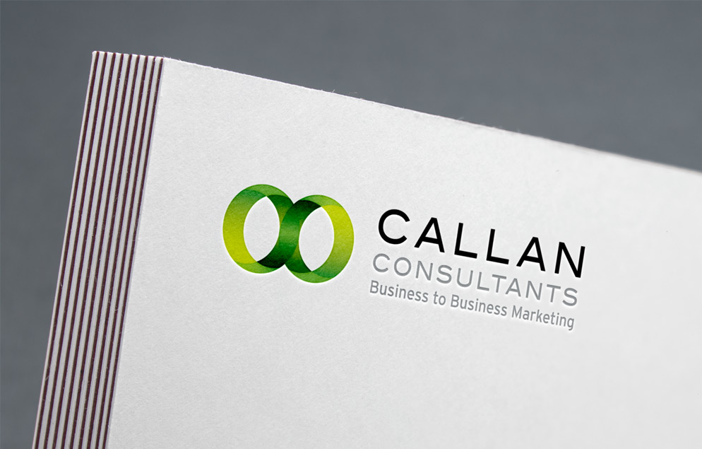
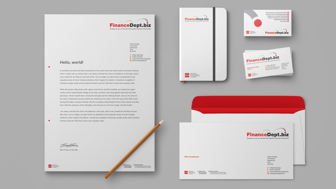
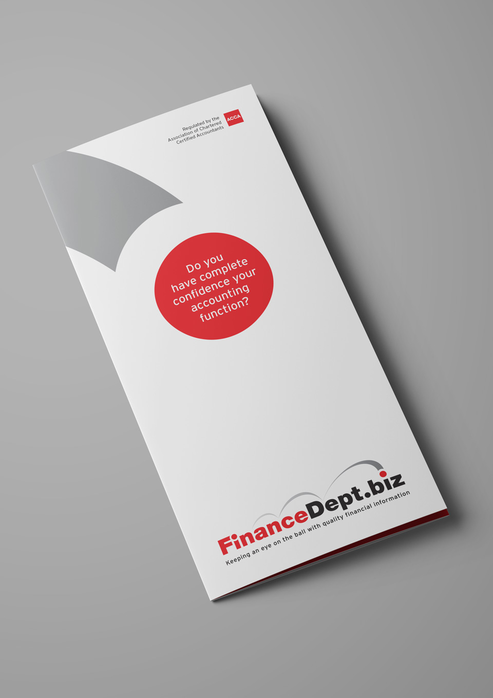
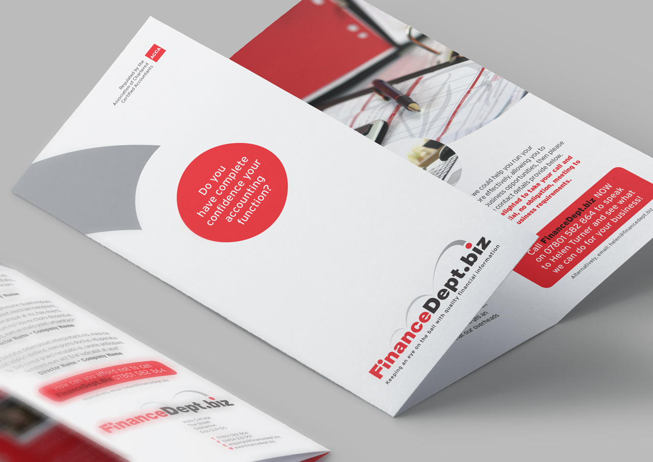
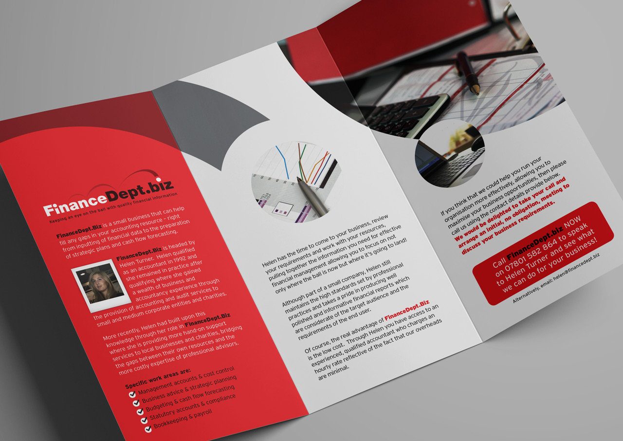
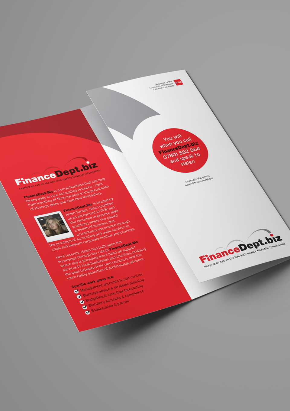
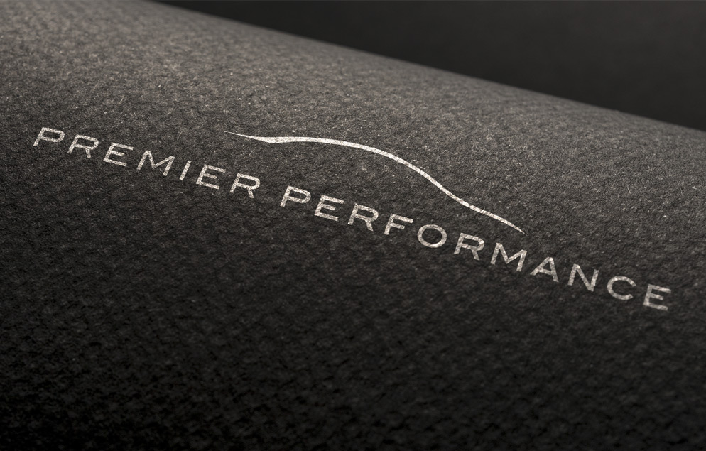
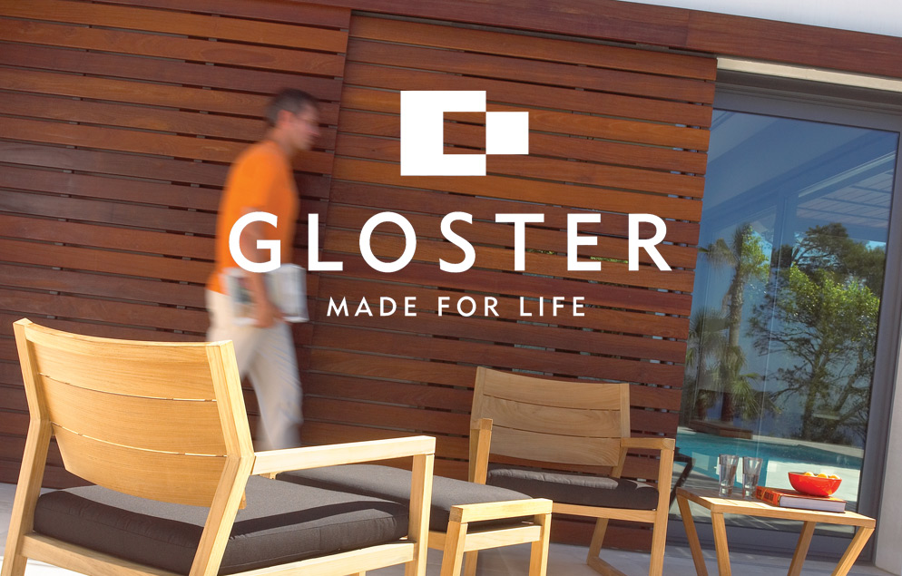
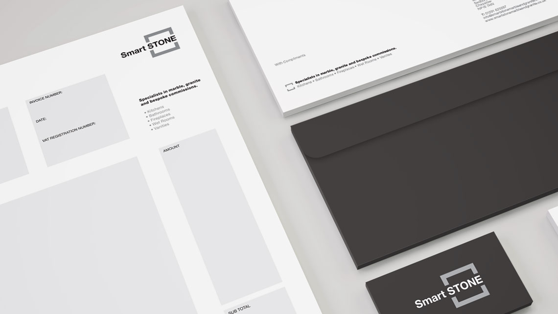
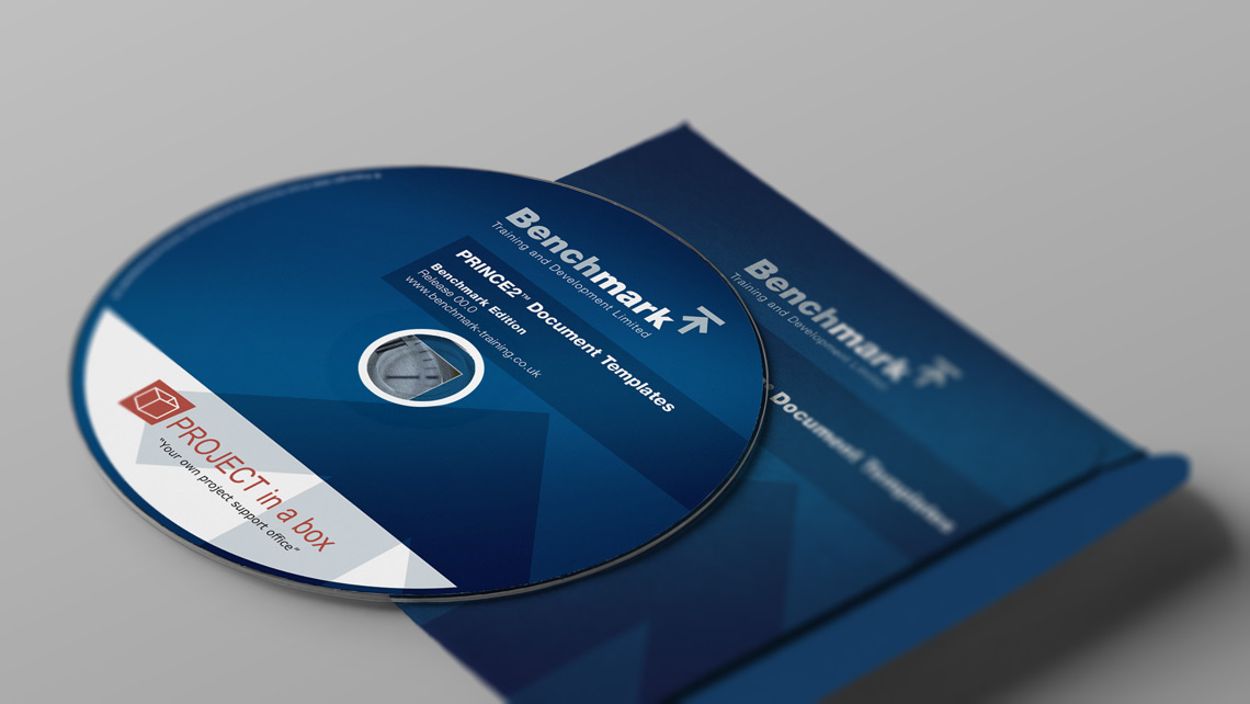
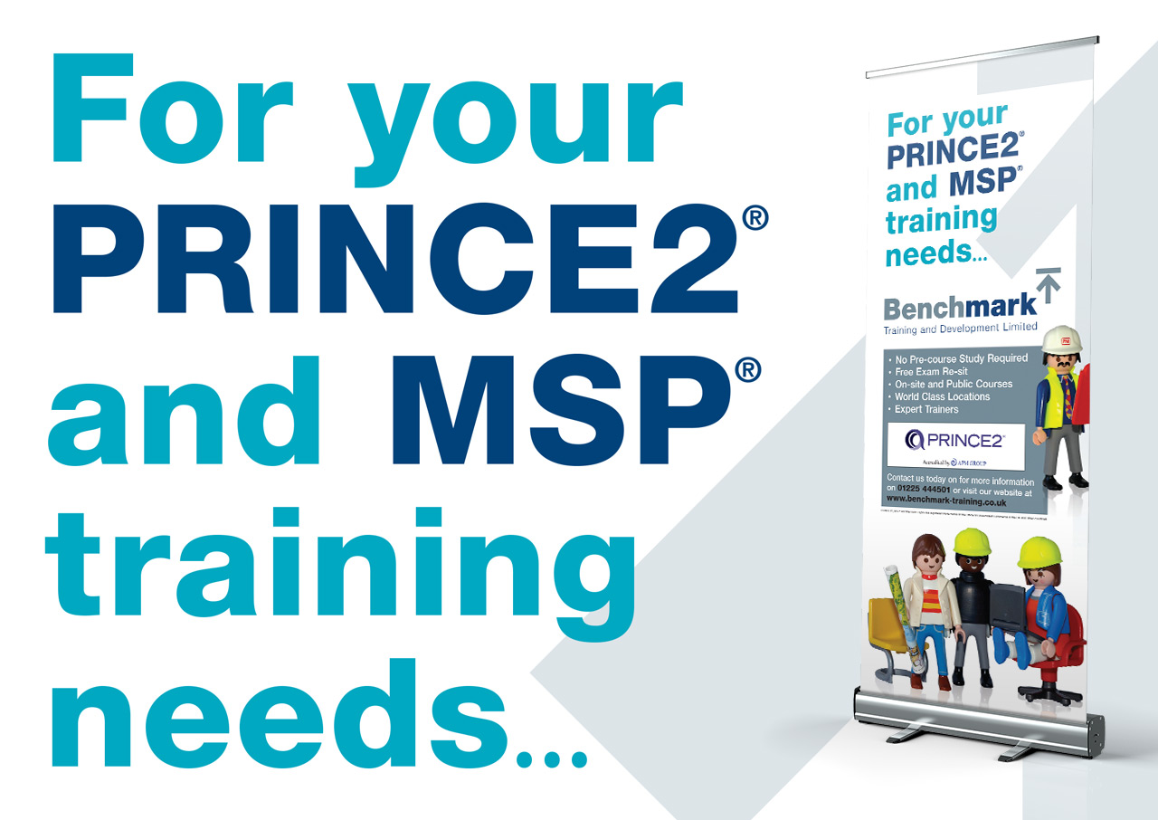
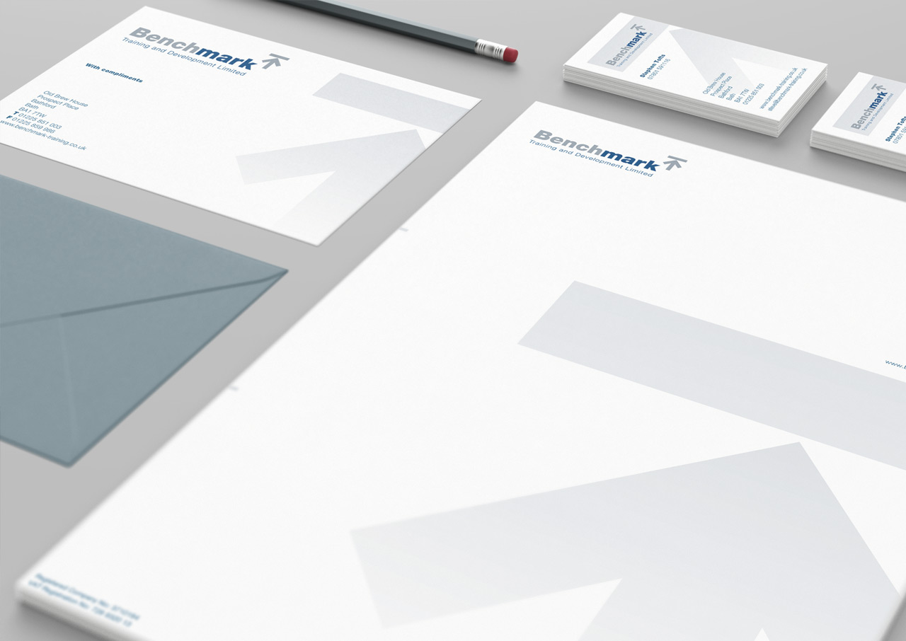
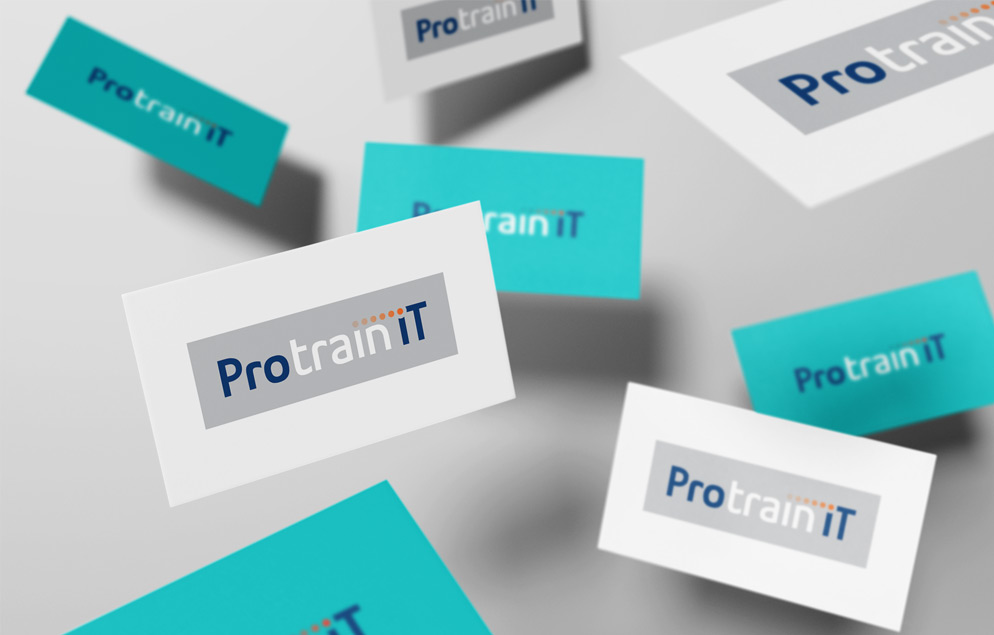
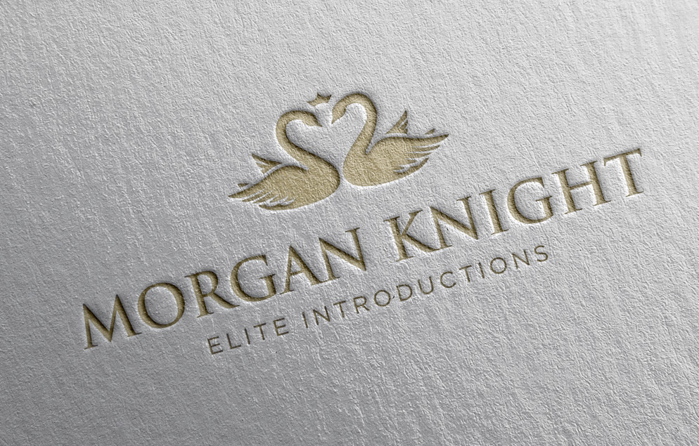
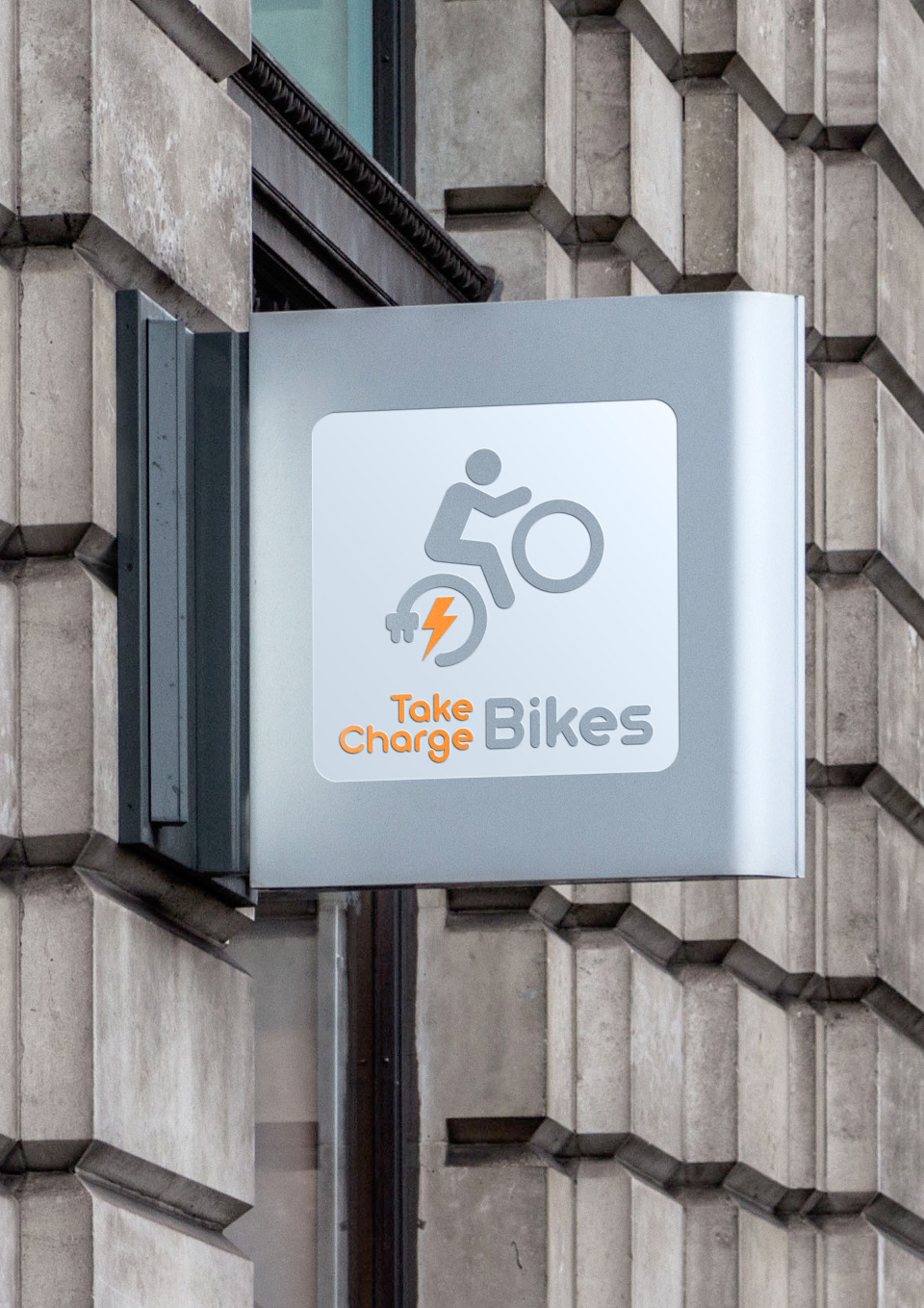
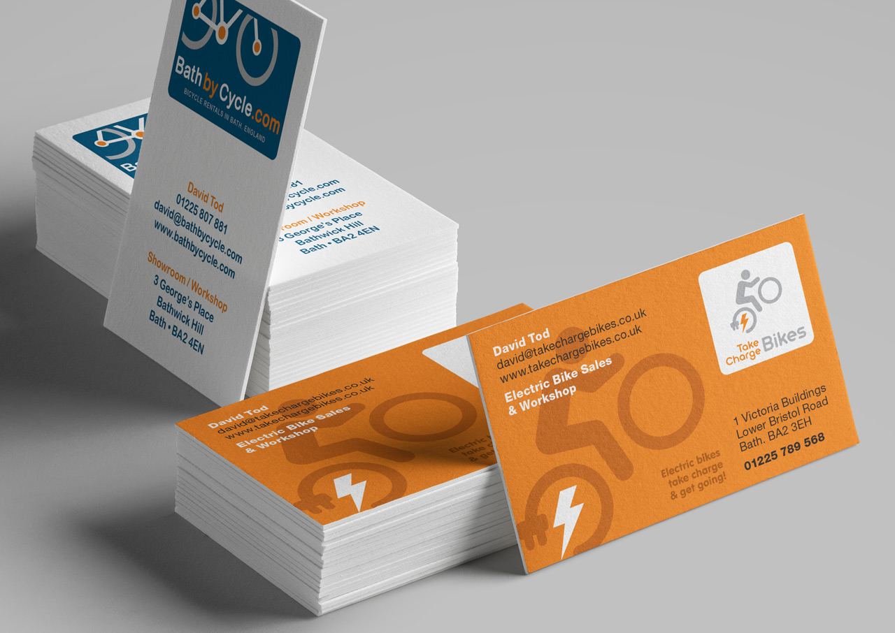
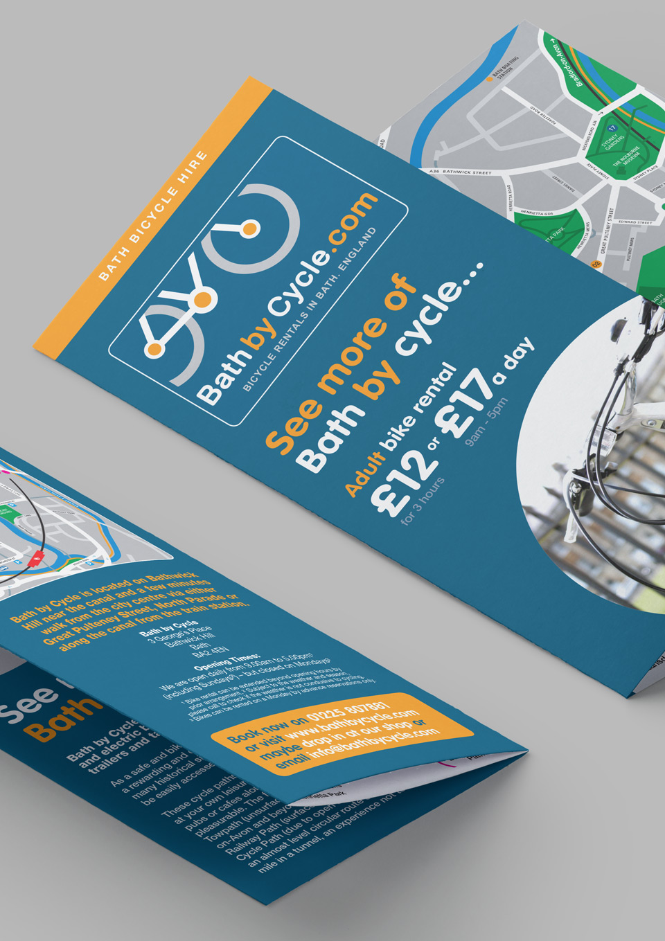
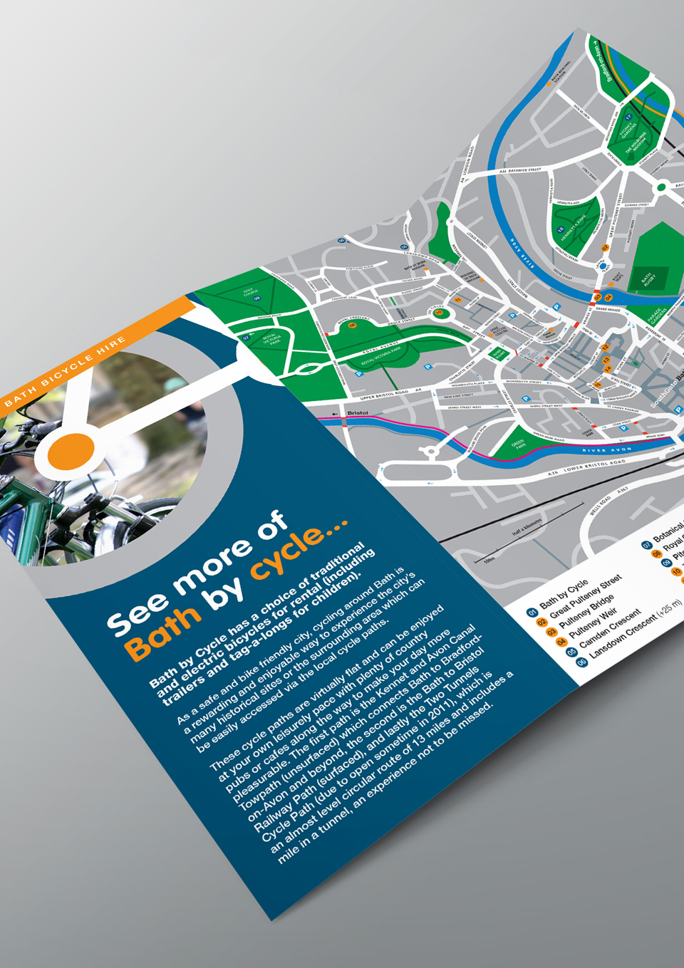
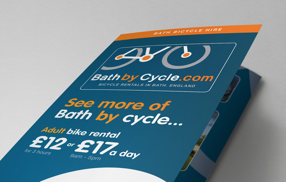
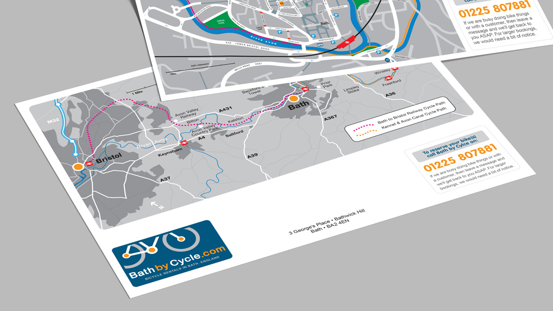
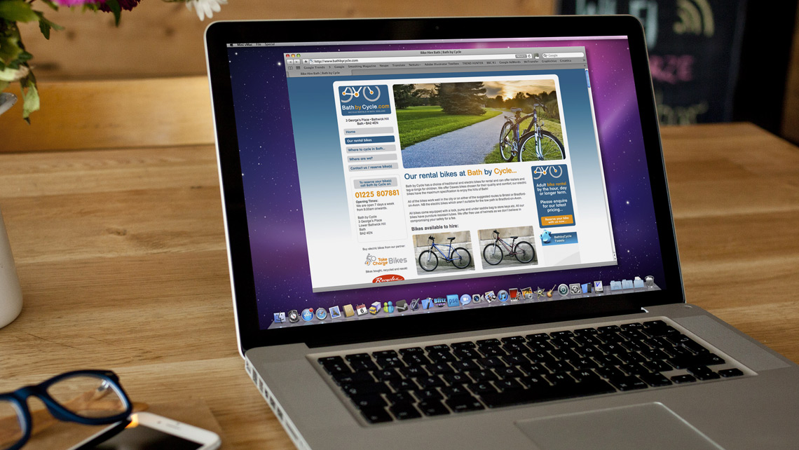
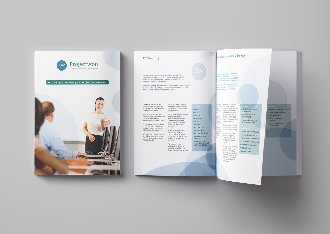
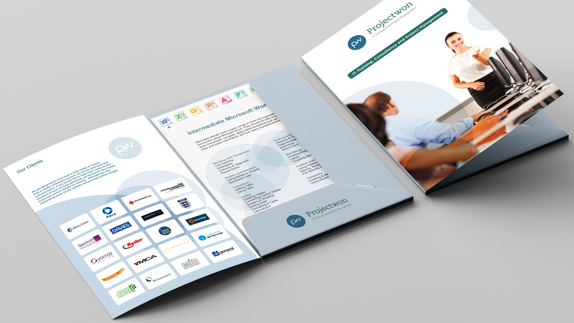
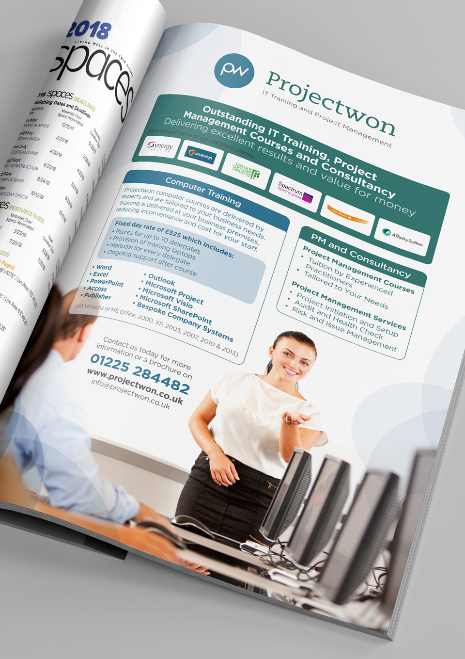
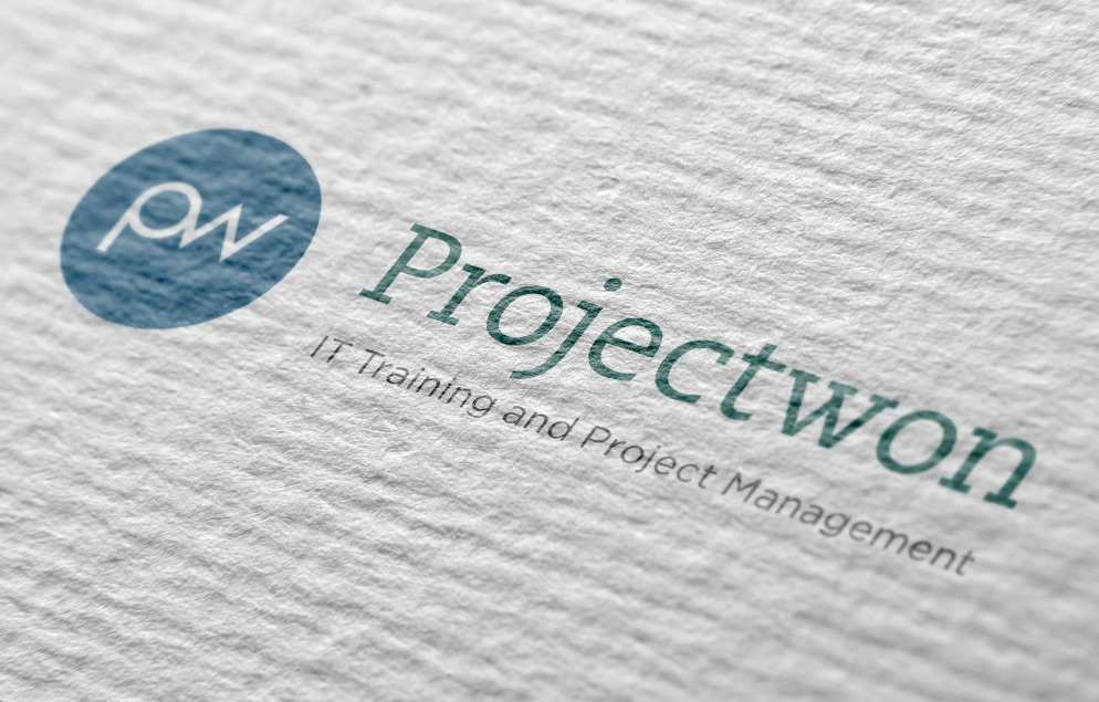
BNHC Logo Design

Client: Bath Natural Health Clinic
Project: Logo Design
About: Bath Natural Health Clinic is a premier complementary health centre, a collaboration of like minded health professionals who have cared for Bath residents since 1986. The building where BNHC are sited came under new ownership, so they enlisted me to create a fresh brand for the practice.


Beauty Logo Design

Client: Fuss Beauty
Project: Logo Design
About: Fuss Beauty is a progressive salon which not only aims to make every client look better, but more importantly – feel better. The name generation for the brand is based around the idea 'to be made a fuss over' which is enhanced by the smily face using the ü.


Furniture Logo Design

Client: Gloster Furniture
Project: Logo Design
About: Gloster have been worldwide leaders in outdoor teak furniture for more than 50 years, they have since expanded into woven, aluminium, stainless steel and outdoor lounge furniture – which is why they needed to re-brand to reflect their new modern and contemporary ranges. The icon is universal and can be seen as a 'G' or a table and chairs from above, pure simplicity.


Shop Logo Design
design
Client: The Grocer on Locksbrook
Project: Logo Design
About: A small corner-shop which combines selling 'deli-style' local produce, serving yummy cups of Illy coffee and hot bites. It creates a real community hub and a delightful shopping experience. The owner wanted a sign/logo to reflect an old school steam engine name plate, using the location of the shop.


Automotive Logo Design
design
Client: Premier Performance
Project: Logo Design
About: Premier Performance are suppliers of performance parts for top marques. As they sell to Aston Martin, Ferrari, Maserati and Lamborghini owners – the logo had to be elegant, refined and not to depict a particular car brand/shape (especially as this is against manufacturers IP).


Cleaner Logo Design
design
Client: Safeclean
Project: Logo Design
About: Safeclean is a cleaning franchise for upholstery, carpets and curtains. The firm is owned by a larger company Guardsman, who wanted to associate their brand and give Safeclean extra credence.


Stone Logo Design
design
Client: Smart Stone
Project: Logo Design
About: Smart Stone are specialists in cutting and fitting all kinds of marble and granite stone to bathrooms, wetrooms, kitchens, floors and fireplaces in both contemporary and classical designs. The nature of the logo reflected pre-cut stone tiles that are used.


Rugby Logo Design
design
Client: BTL
Project: Logo Design
About: Bath Touch (Rugby) Leagues logo visually depicts a rugby ball and one of Bath's famous landmarks – Pulteney Weir, which funnily enough is located right next to the official Bath Rugby ground.


Event Logo Design
design
Client: Whole Nine Yards Productions
Project: Logo Design
About: Whole Nine Yards Productions is a multi-disciplinary production company specialising in the delivery of production services for live events. The logo brief was that it had to be a strong graphic shape, so I concentrated on the designing the WNY lettering, to result in a continual typographic wny.


Bench Logo Design
design
Client: Benchmark Training and Development Ltd
Project: Logo Design
About: Benchmark offer unparralleled training in PRINCE2 project management qualifications, they required a logo that was clean and visually demonstrated the need to acheive the higher 'benchmark' was is indicated by the simple arrow and marker depicting the level of the benchmark.


Agency Broker Logo Design
design
Client: Idealogic
Project: Agency Broker Header
About: Commisioned by Idealogic, I had to come up with a masthead logo for a legal newsletter based on the strapline, 'Opening the lid on legal news and information. This is visualised by a graphic representation of an opening (lifting) 'lid' on a box. The client was really happy with it and was rolled out online too.


Consultant Logo Design
design
Client: Callan Consultants
Project: Logo Design
About: Callan Consultants are a business to business marketing consultancy whom we work with, their original logo was purely typographic in a single font and lacked an identity. They commissioned me to product a new identity, which is based around using the two C's interlocked to create an infinity symbol, illustrating the unity of business and marketing together.


AW Logo Design
design
Client: Alison Wilding
Project:Private Individuals Logo Design
About: Alison Wilding is a highly trained and accomplished homeopath. The logo design uses and illustrative example of a pilule, which is the 'tablet' used in this alternative medicine. I wrapped the pilule in leaves to enhance the natural aspect and linked the colours across the typographic lettering.


Finance Dept Logo Design
design
Client: FinanceDept.biz
Project: Logo Design
About: FinanceDept.biz is a small company that can step in and support or replace any companies finance department at a moments notice. The client led strapline 'keeping an eye on the ball with quality financial information' led instinctively to draw up an elegant bouncing ball integrated with the i in biz.


Bike Logo Design
design
Client: Take Charge Bikes
Project: Logo Design
About: This is the logo for a new bike shop opening up in Bath with the implicit aim of just selling electric bikes to the public and online. The logo design incorporates an electricity spark and an electric plug into the back wheel design of a bike symbol, which as they also sell electric mountain bikes, is transversing the logo text.


Wire 9 Logo Design
design
Client: Wire 9 Telecoms PLC
Project: Logo Re-design
About: Wire9 is a telecoms infrastructure operator and software developer which offer advanced & convergent white-labeled telecoms solutions across data, telephony, mobile and VoIP. The logo is based around sound waves, a simple communication form.


Paperline Brand Rationalisation
design
Client: Paperline
Project: Brand Rationalisation
About: Paperline have many facets to their company, Paperline (hygiene product distribution) and another similar hygiene product business called 'Hygiene Depot', both of which distribute their 'own' own brand consumer product line called 'PRO Hygiene' but not exclusively, so it had to retain itself as a brand in its own right, sounds complicated? – well yes it was. That is before I had to take into account that Paperline wanted to phase out a heap of existing marketing material stock too. Basically I had to devise a way of incorporating the PRO Hygiene into both logos and then work out to either recover old brochures or use stickers, whilst porting over the design to new material. The Paperline logo gained the strapline 'Manufacturers of PRO Hygiene' and the Hygiene Depot logo gained the line 'Proud suppliers of PRO Hygiene'. These were used on replacement covers and stickers on marketing collateral until a full re-design allowed after diminished stock piles.


Equine Logo Design
design
Client: Keratex Hoofcare
Project: Sub-brand Logo Design
About: Keratex Hoofcare produce the leading hoofcare products in Europe and the US. They needed a logo that could be used for onsite promotion at equine events and exhibitions. The logo with the addition of the jumping horse was printed on hand out materials and giftware, such as rider clothing, pens, horse trailers and feed bags.


If you like what you see, then get in contact to see what I can do for your logo design.


More logos will be uploaded soon, please check back again for regular updates...


AigaDesign CouncilChartered Society of DesignersDesign Business AssociationInternational Society of Typographic Designersicograda
TwitterFacebookLike or follow
Design Intellect
on social media

VIEW PORTFOLIO BY CATEGORY:
Advertising
Brochure Design
Graphic Designer (Testimonials)
Logo Design
Map Design
Marketing
Packaging Design
Web Design
Covering Bristol Bath and Swindon.

Privacy PolicyCV
Copyright © 2003-2013