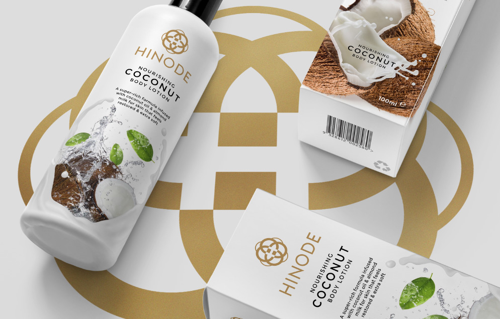
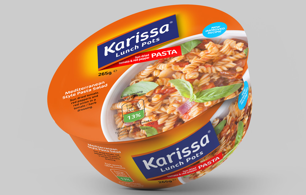
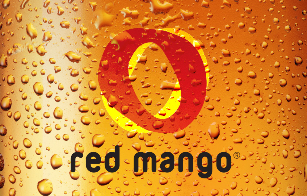
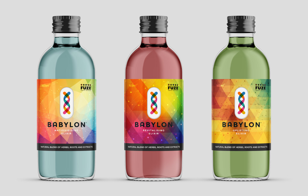
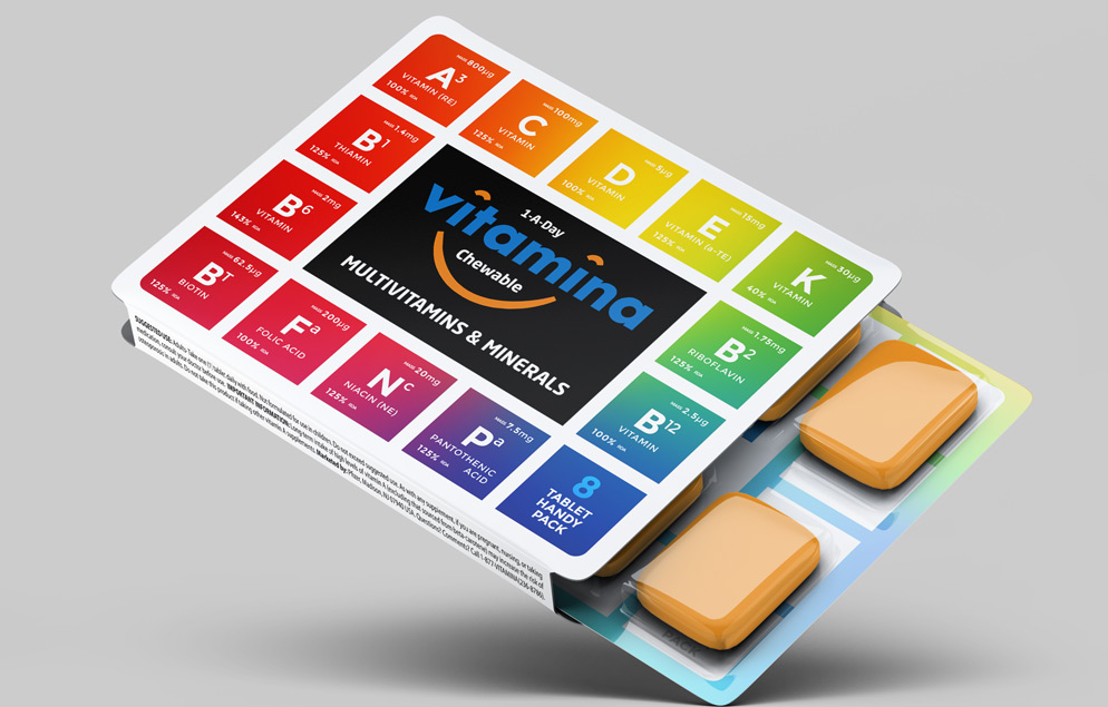
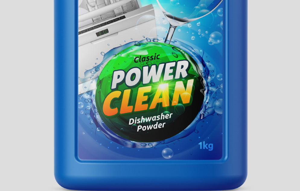
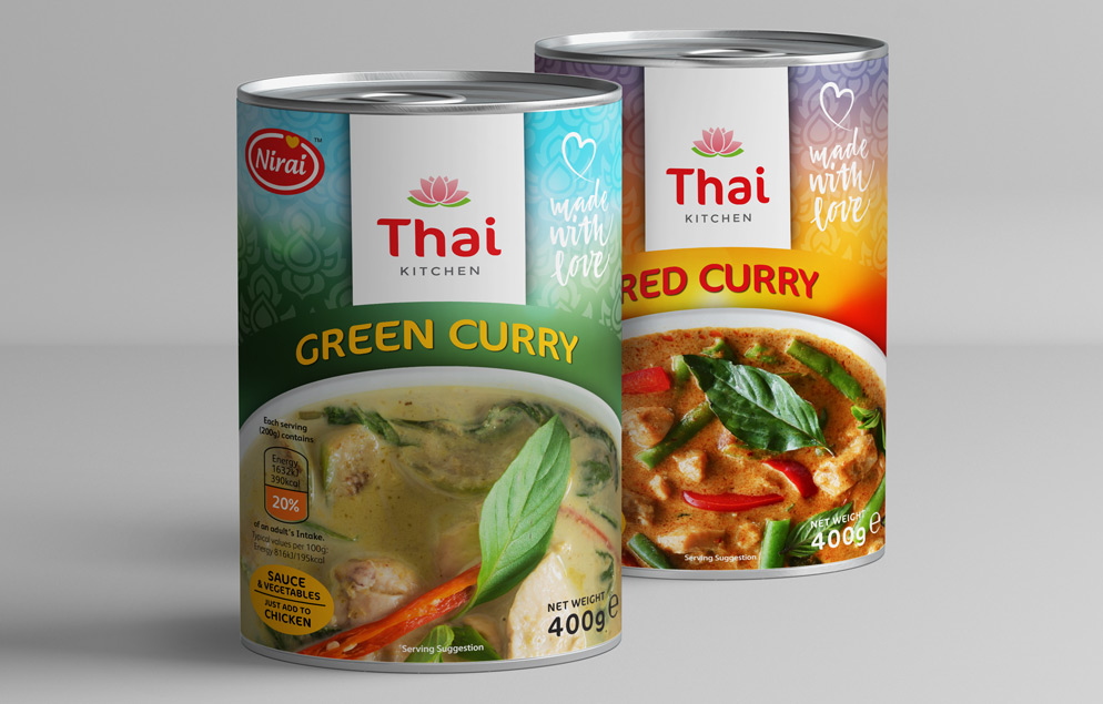
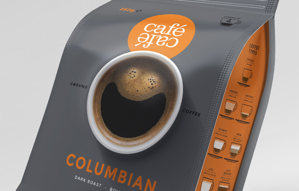
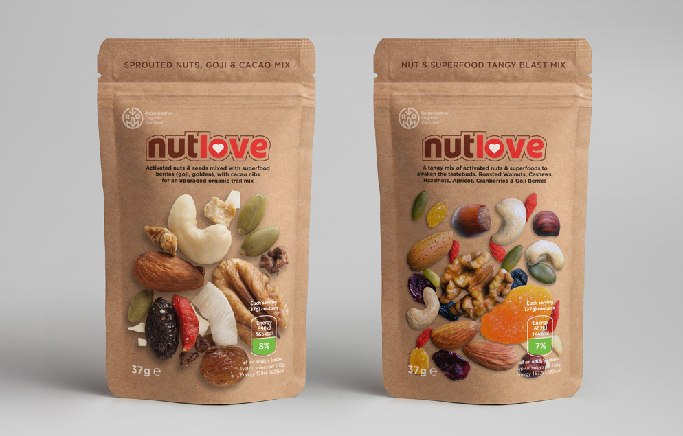
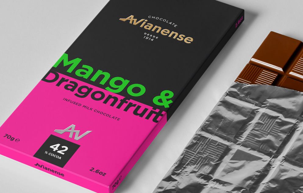
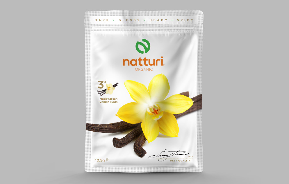
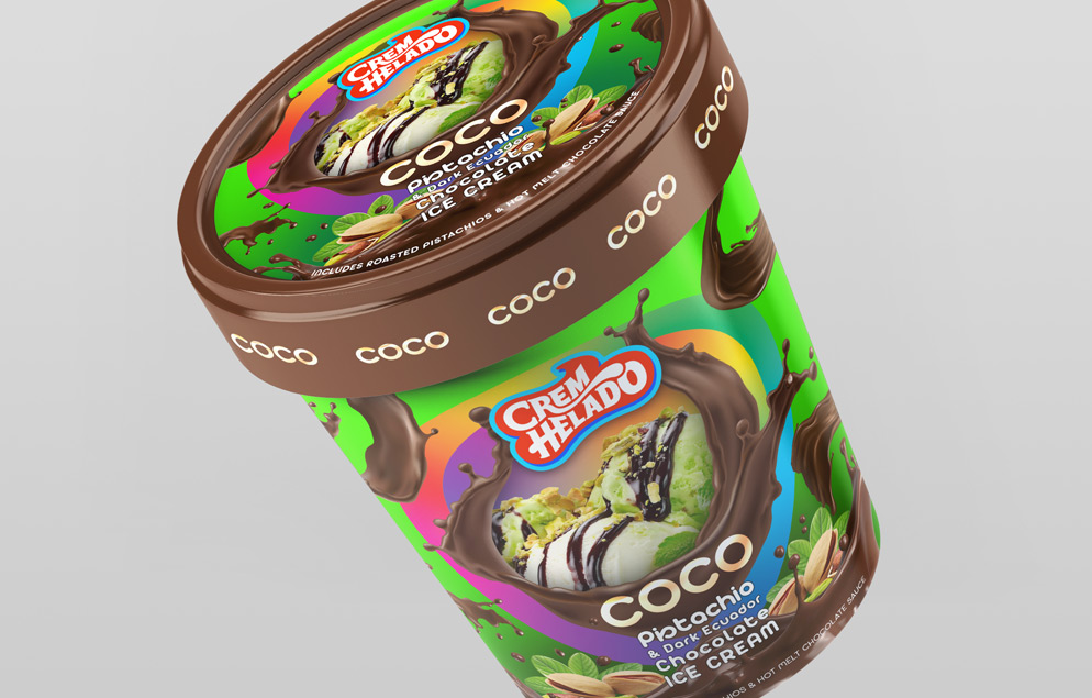
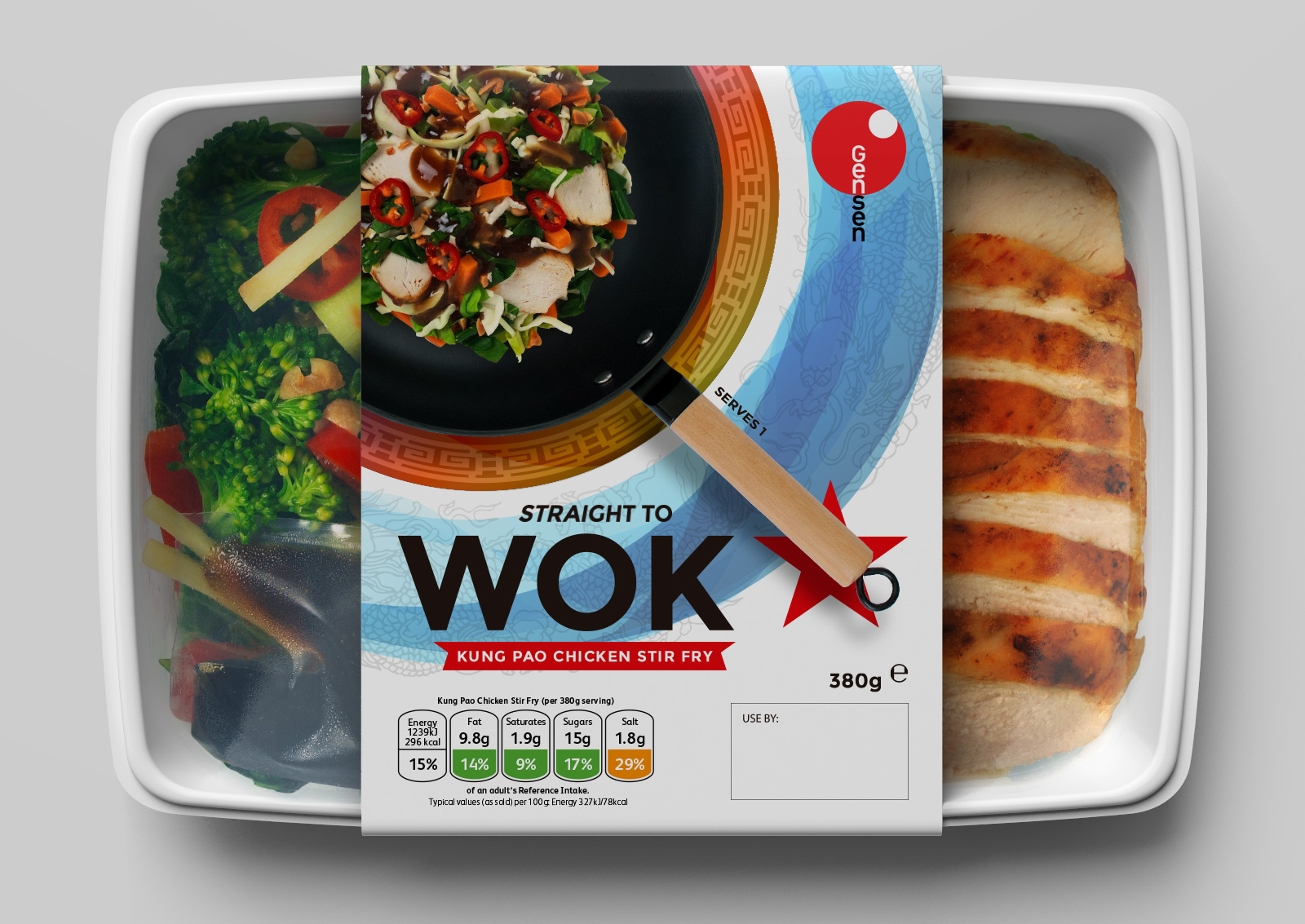
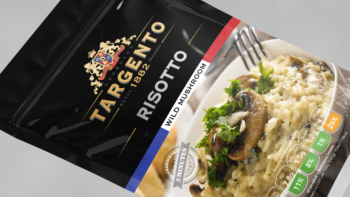
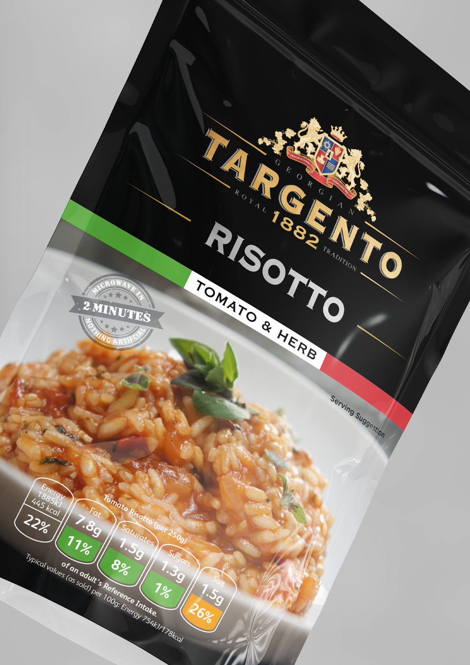
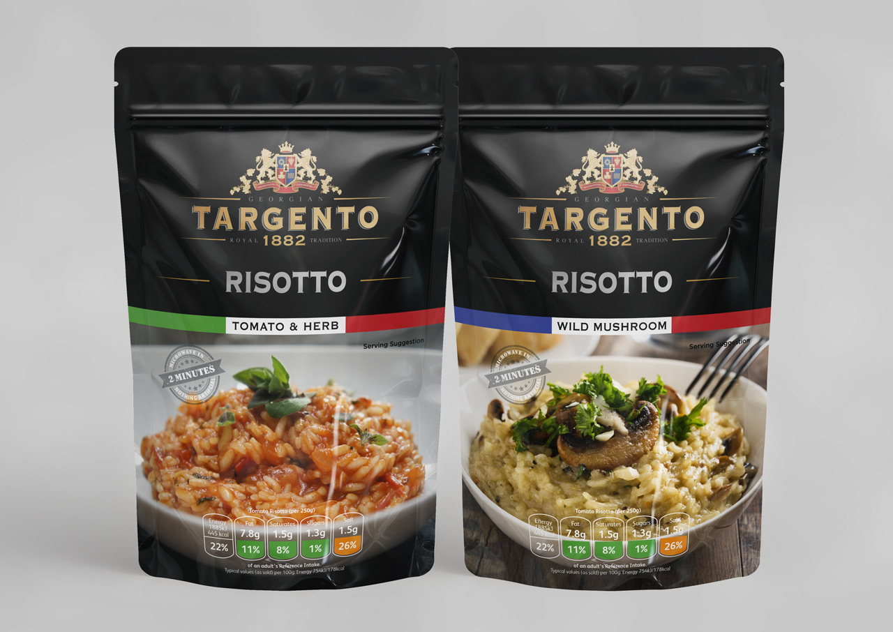
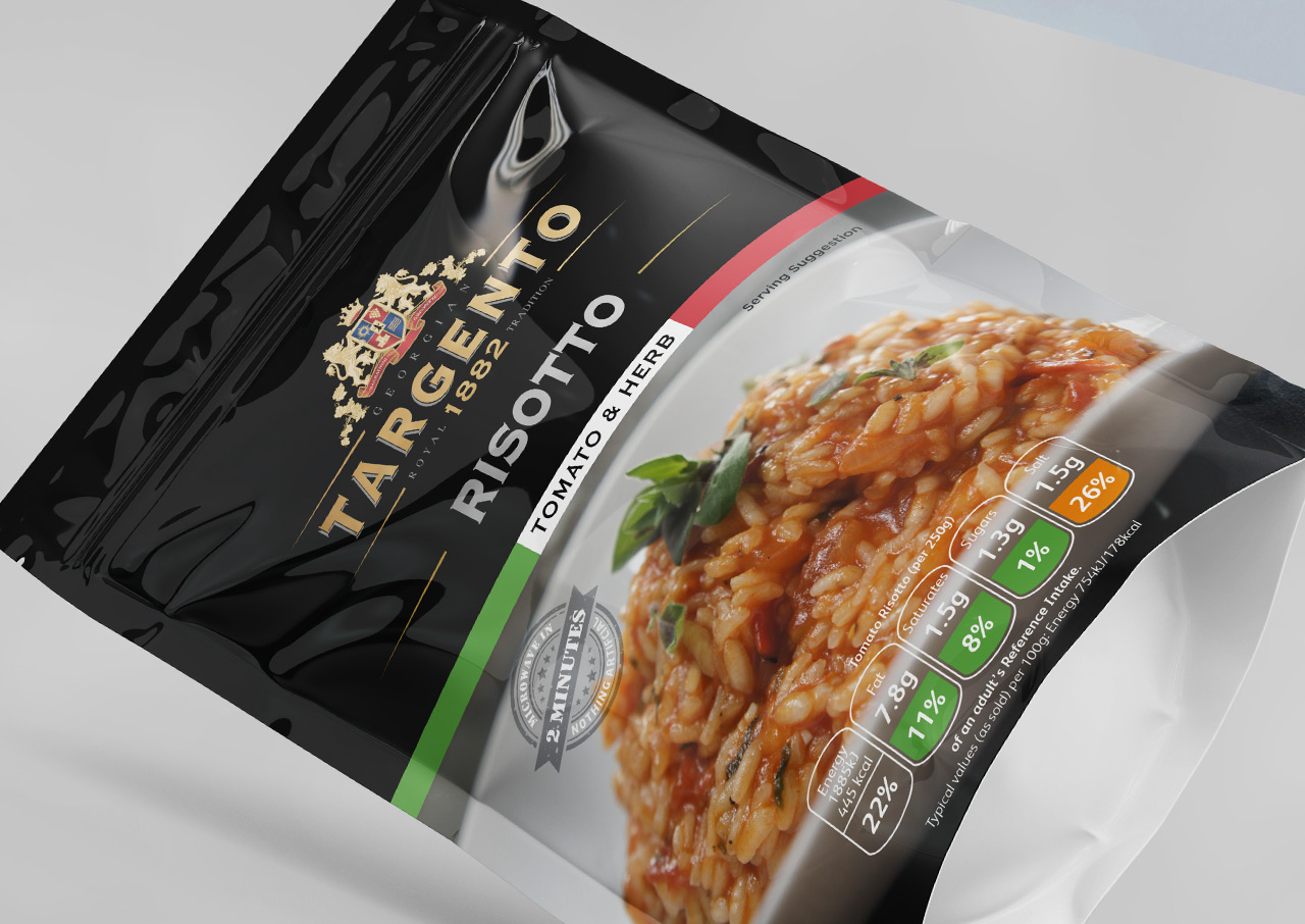
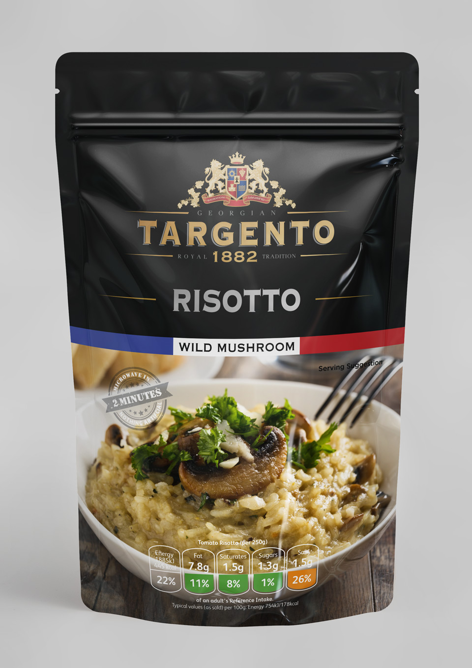
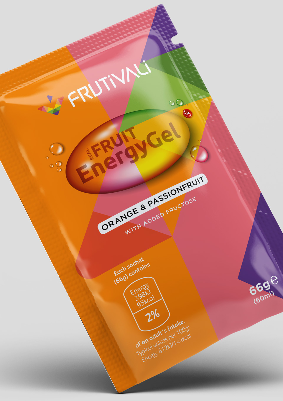
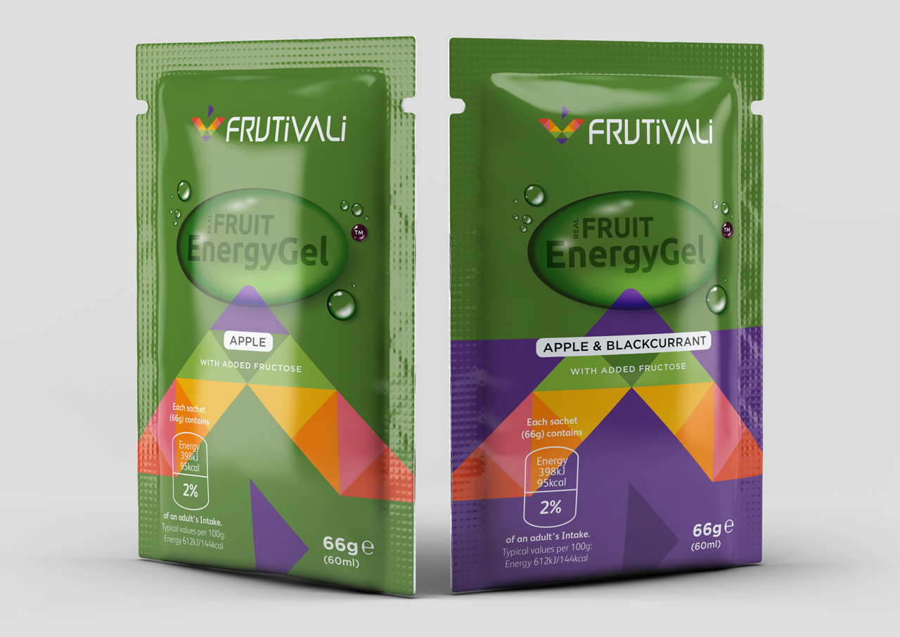
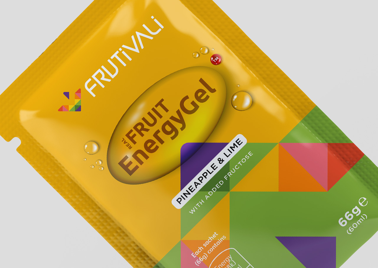
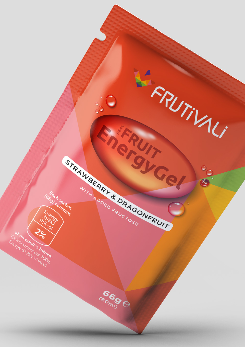
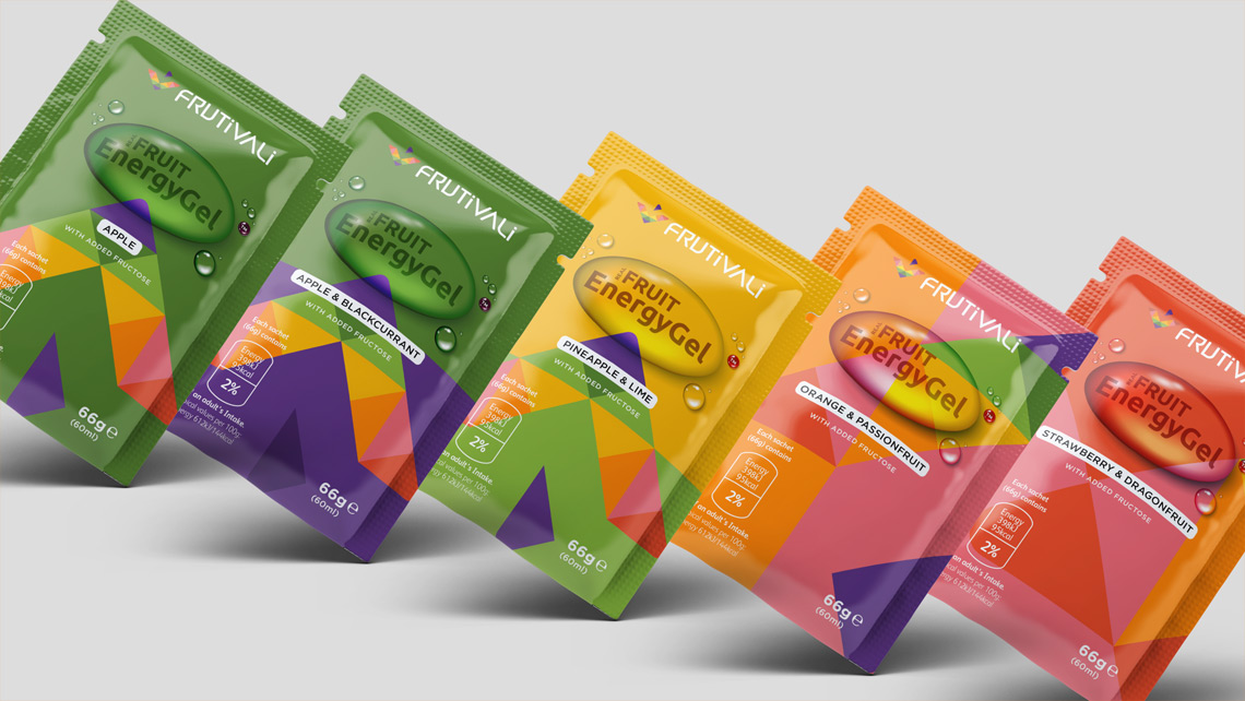
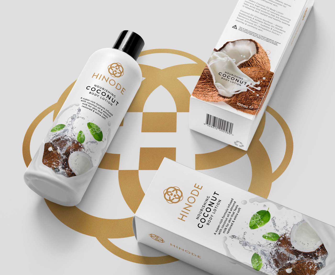
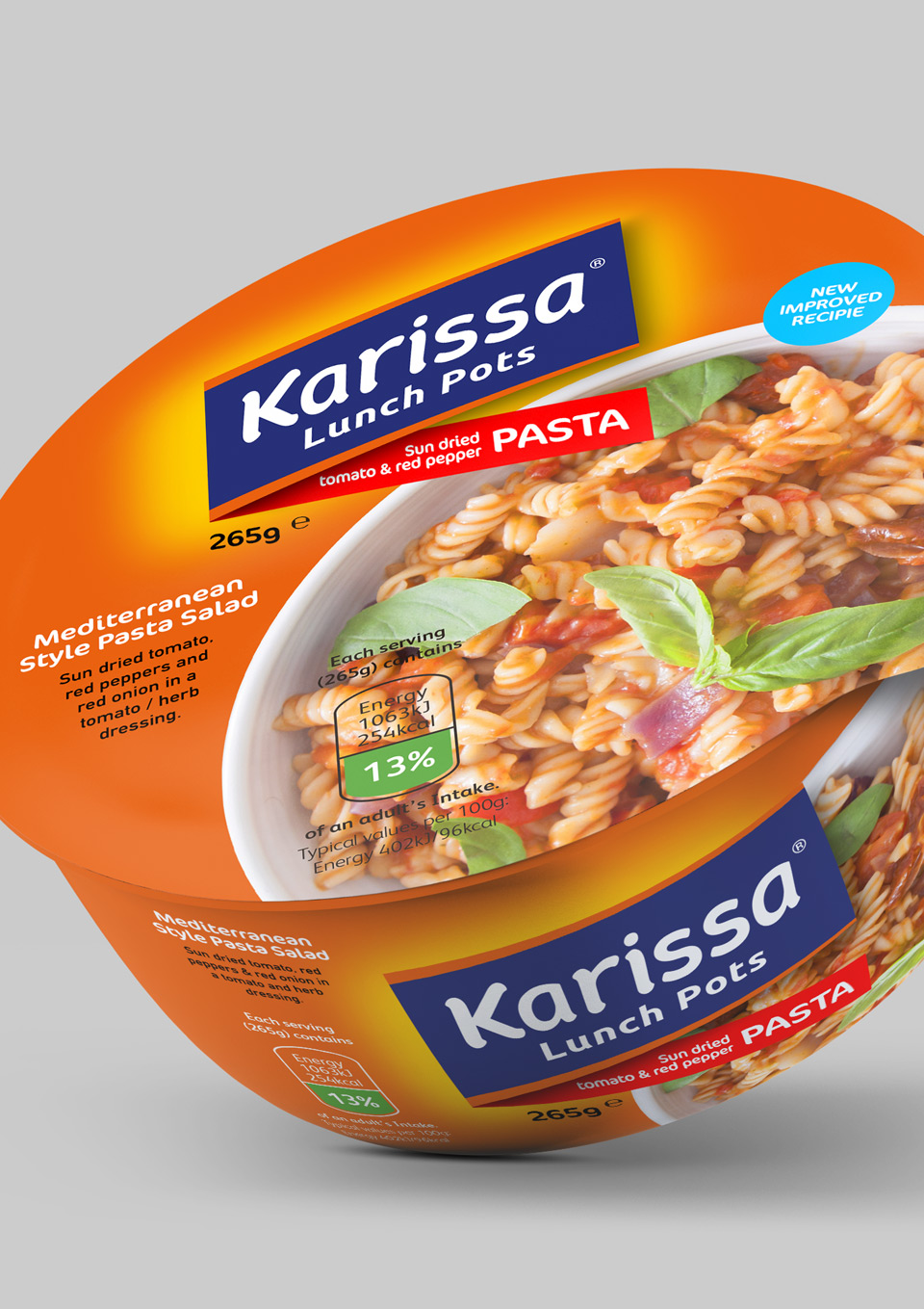
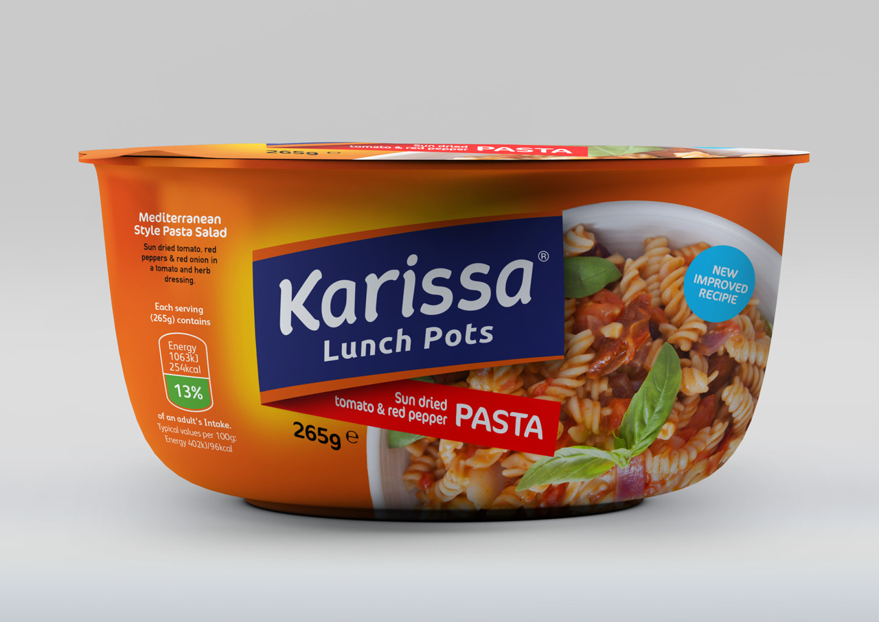
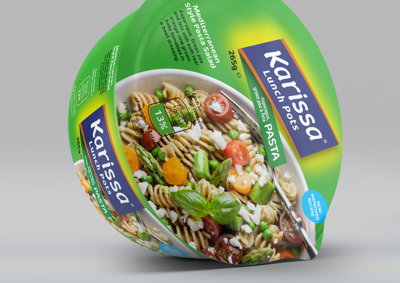
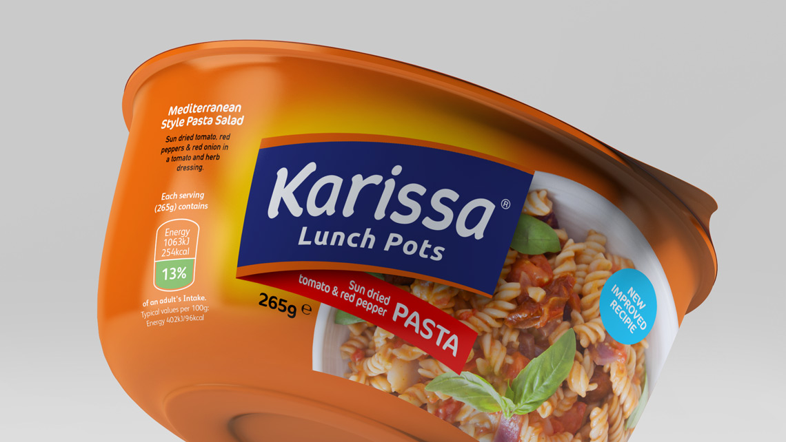
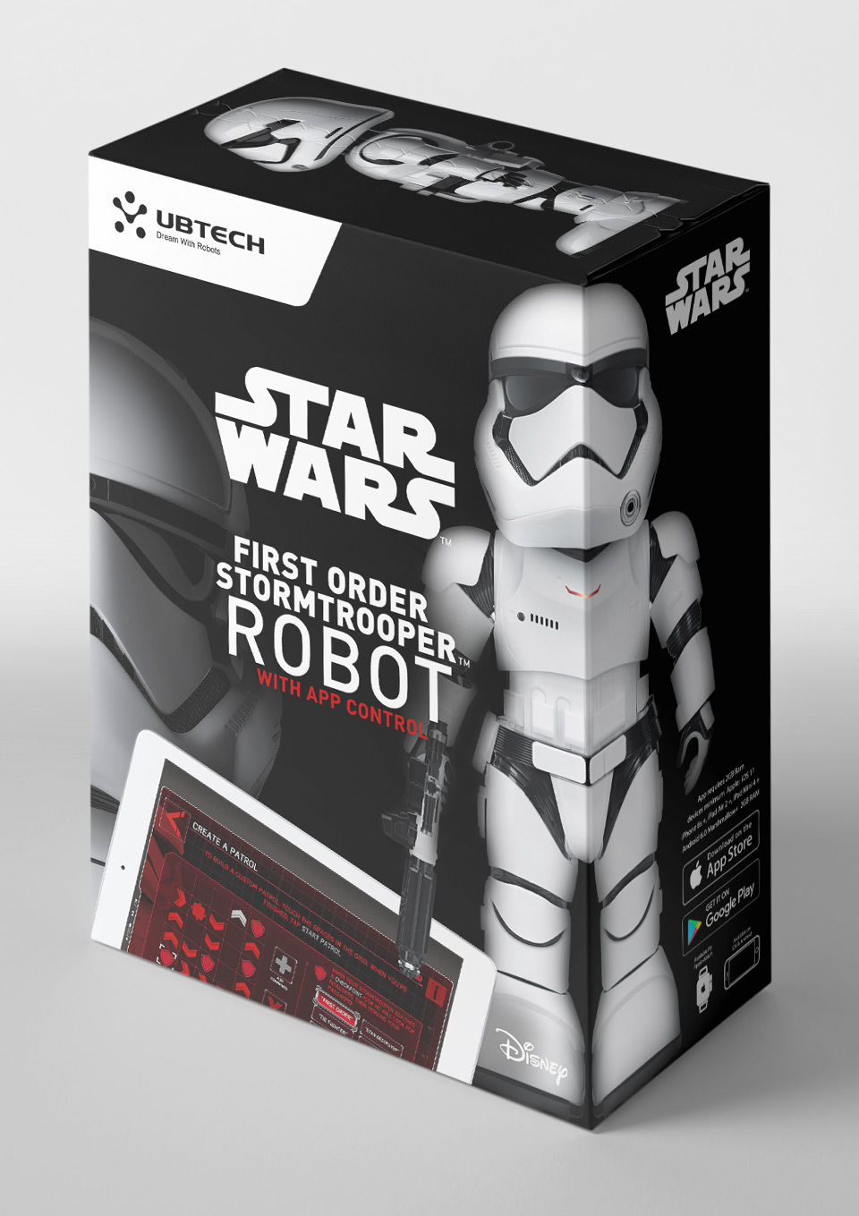
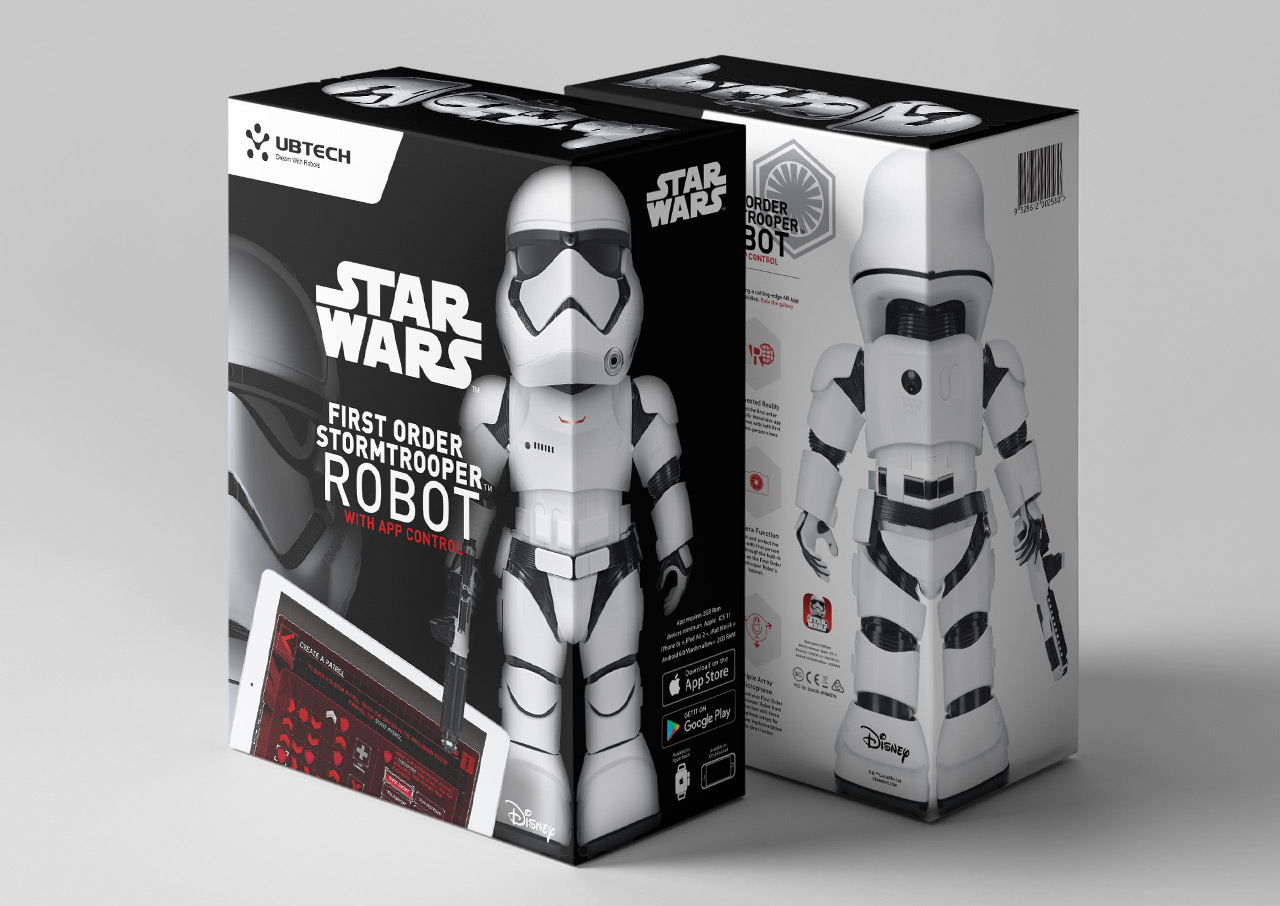
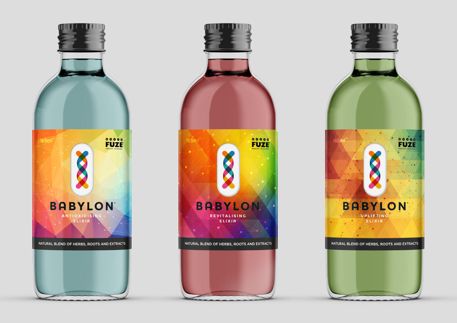
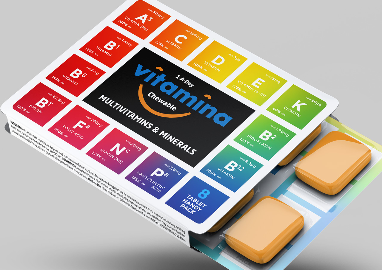
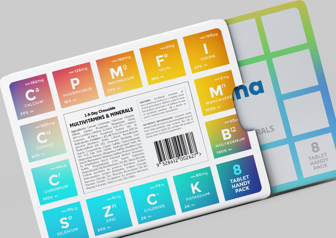
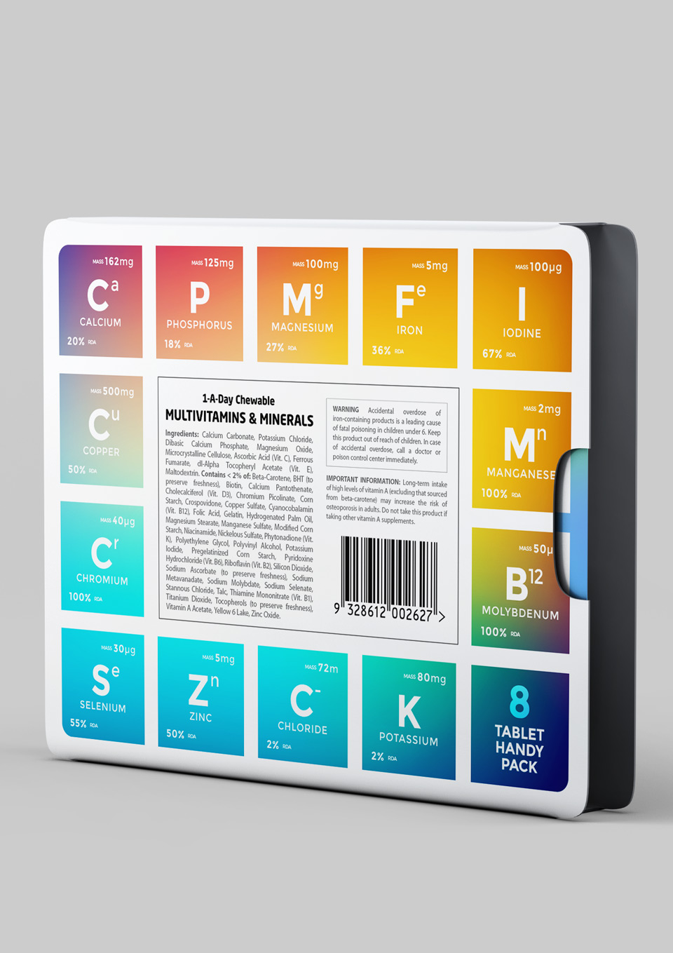
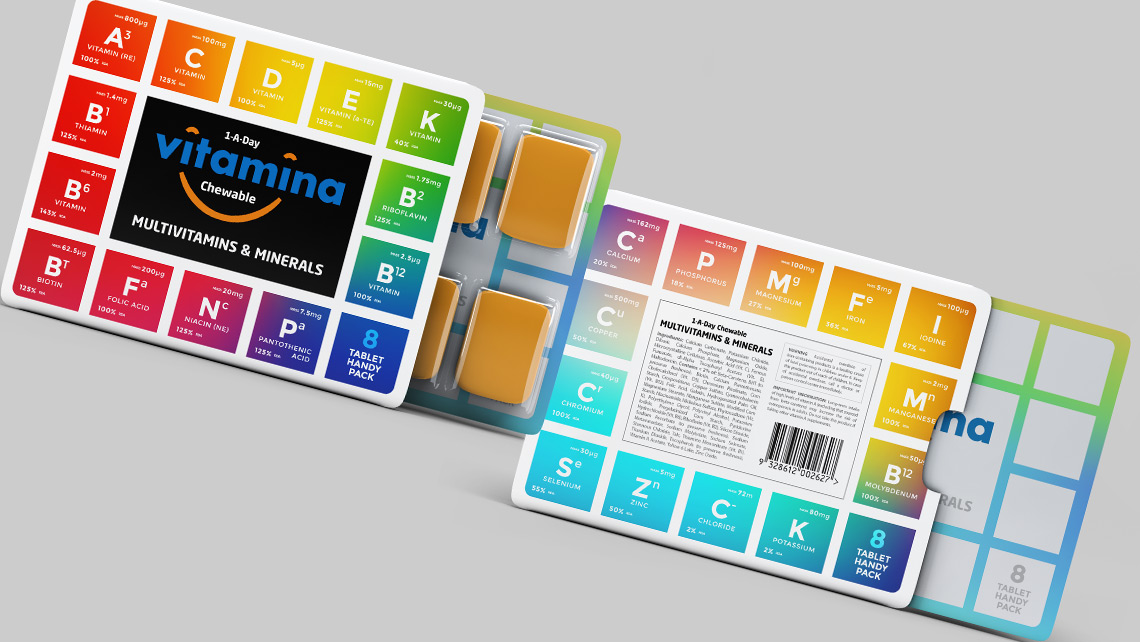
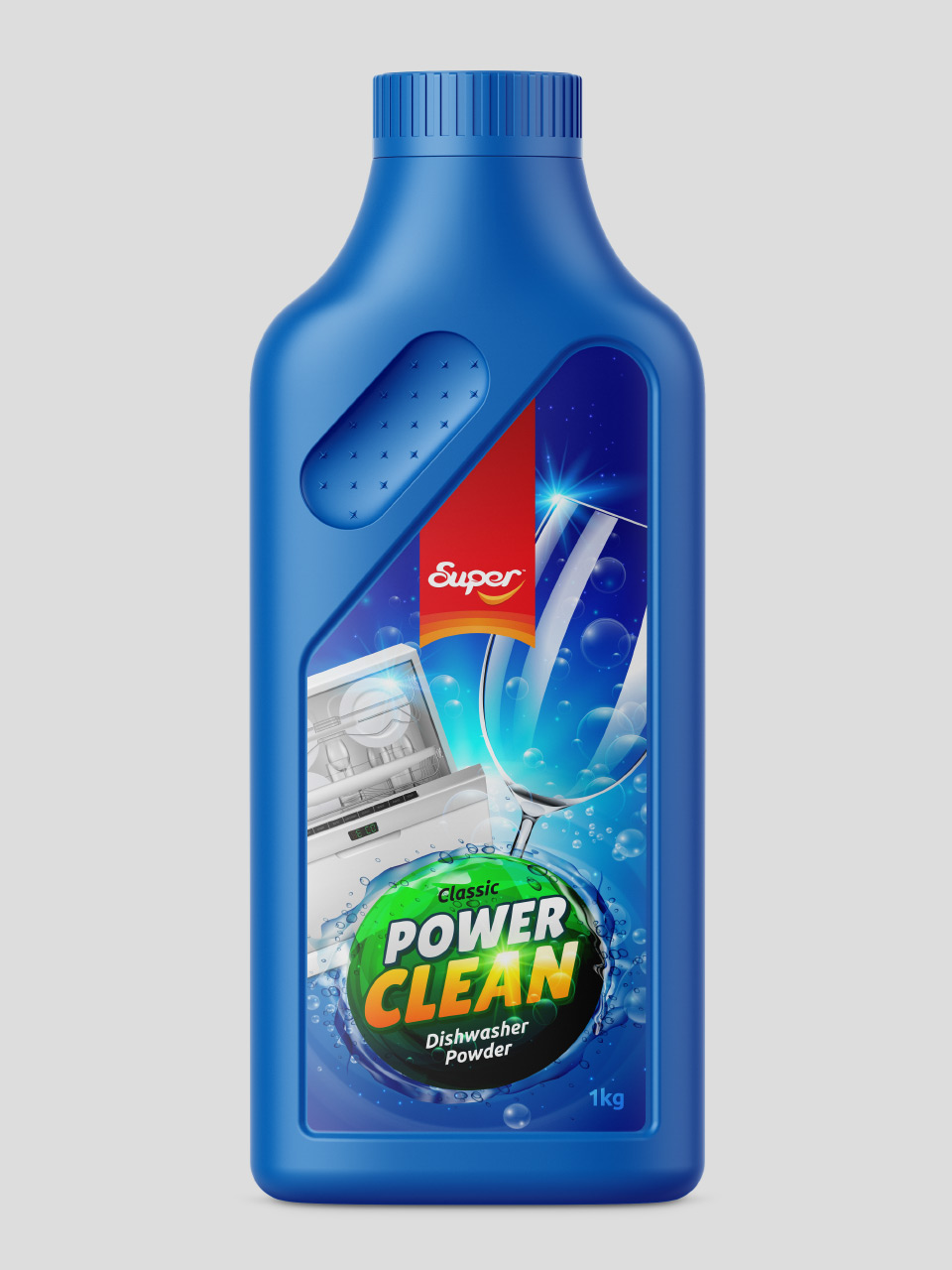
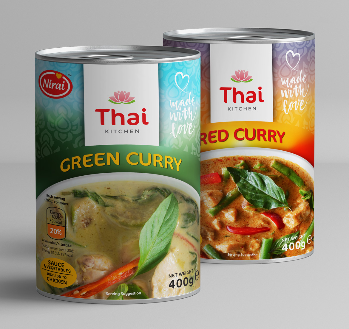
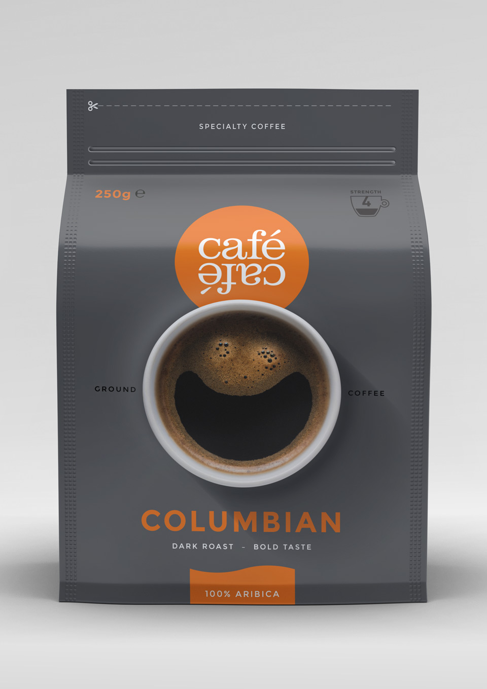
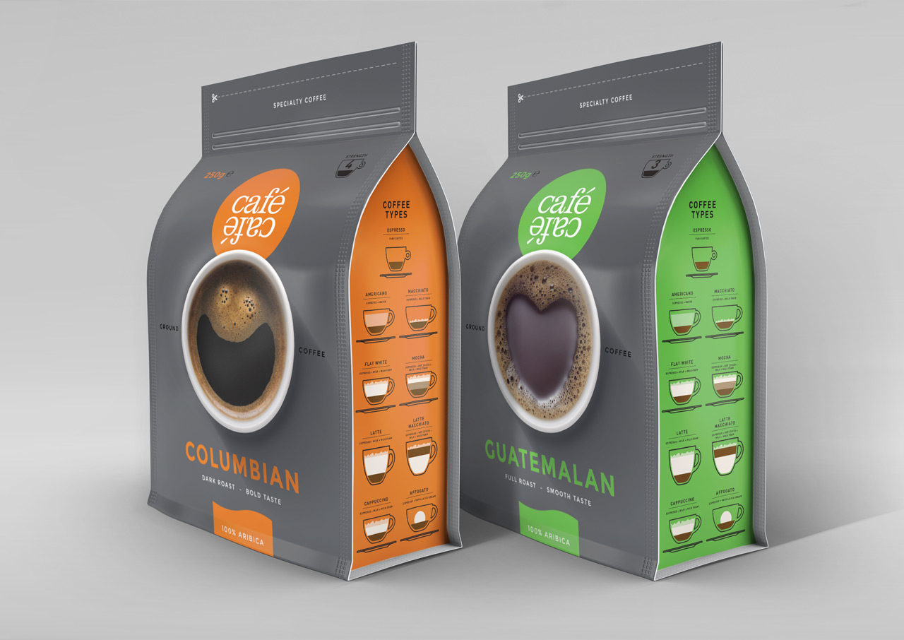
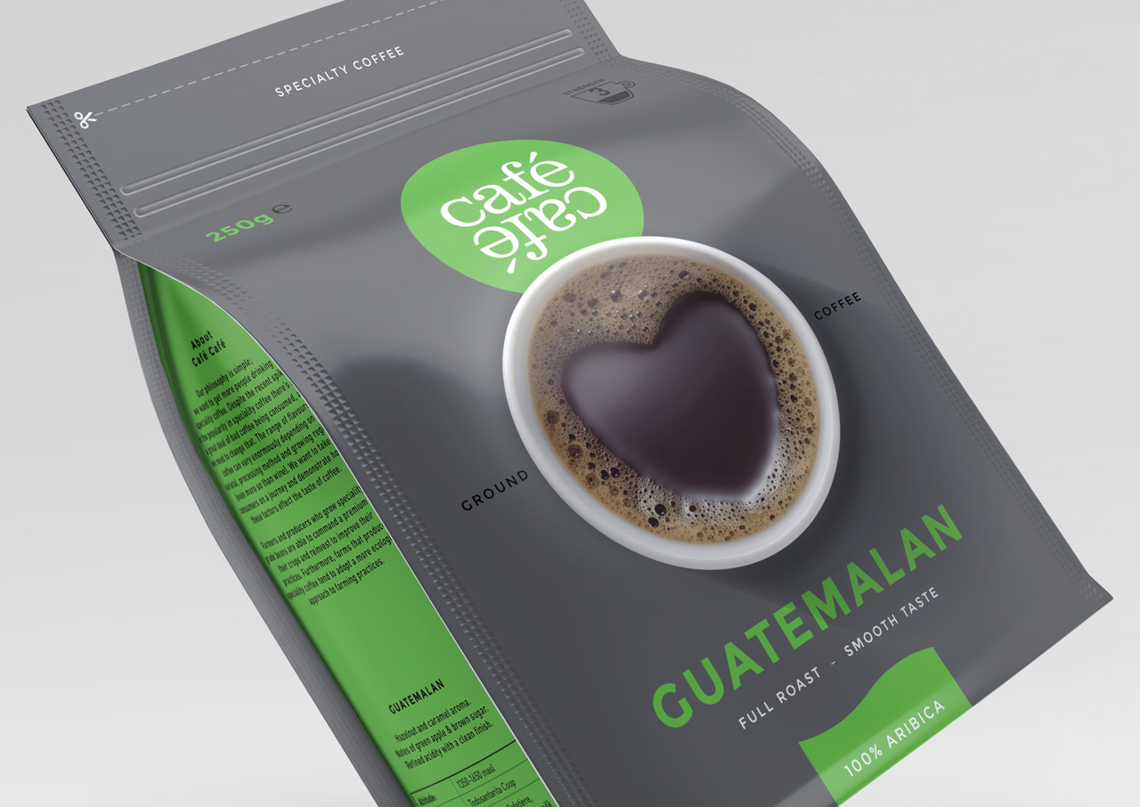
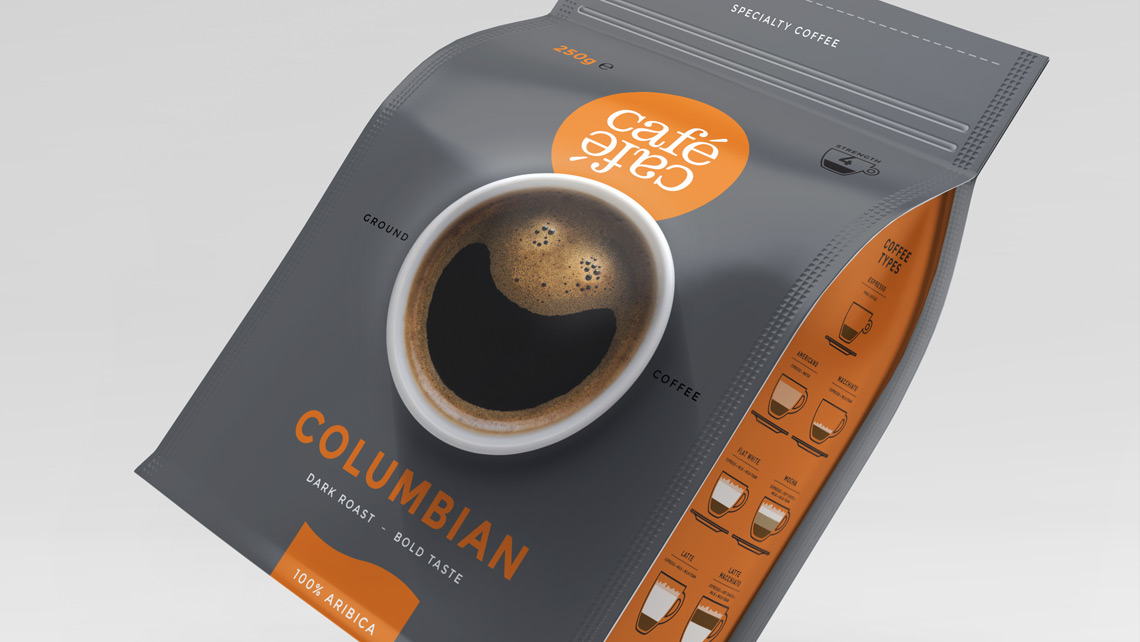
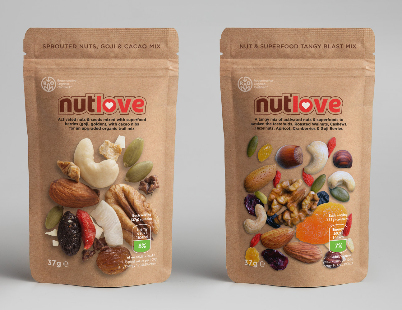
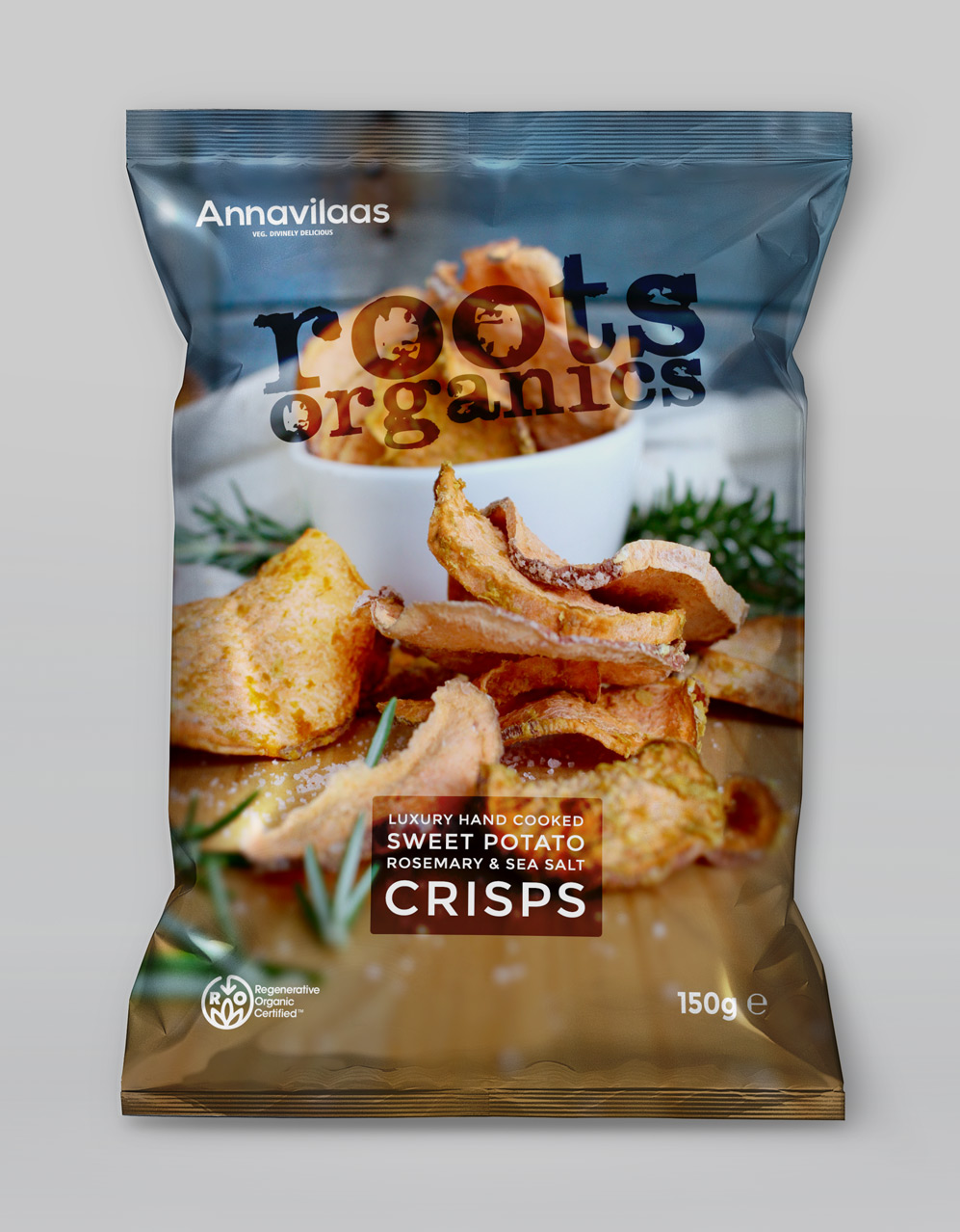
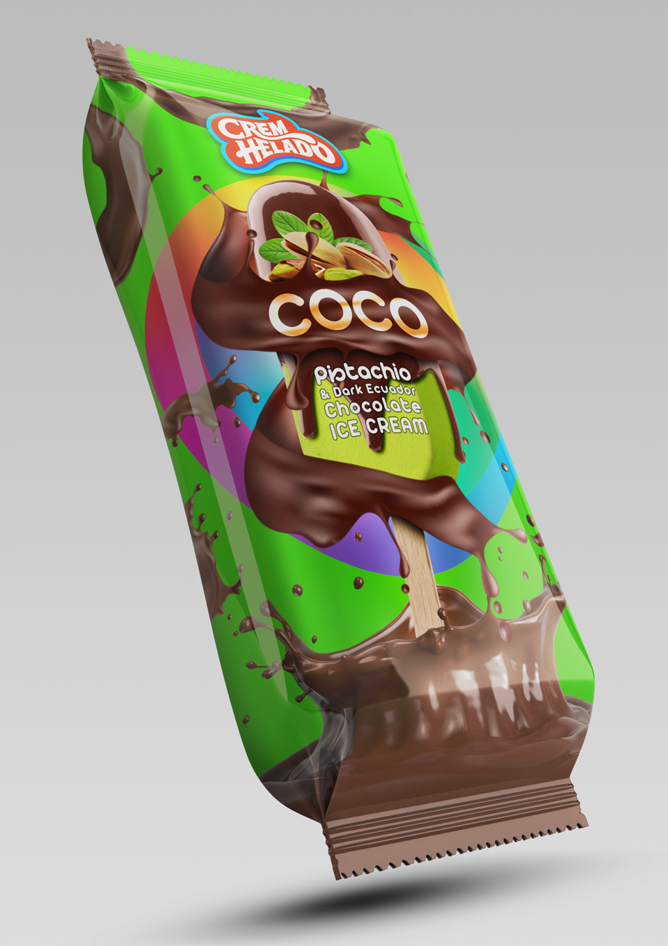
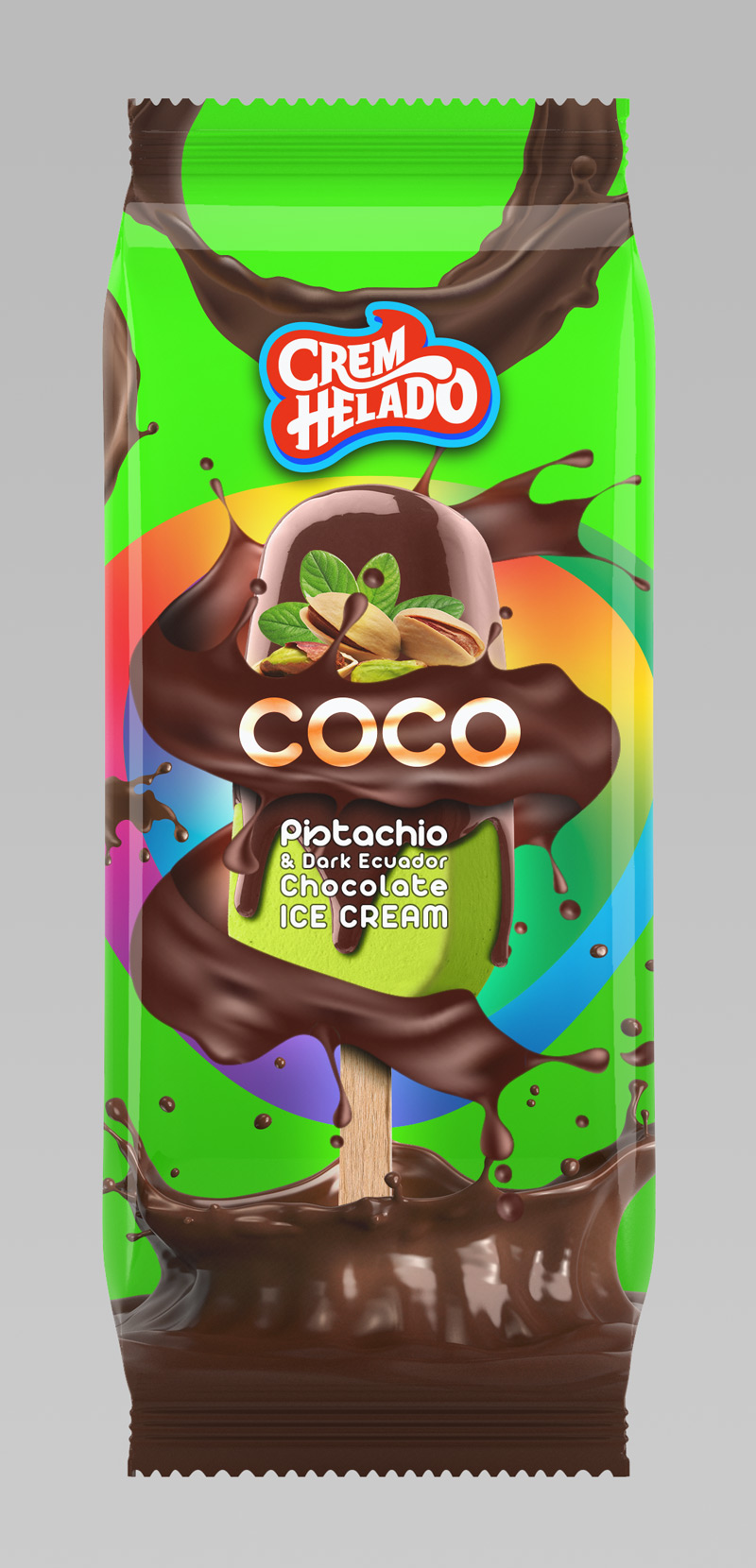
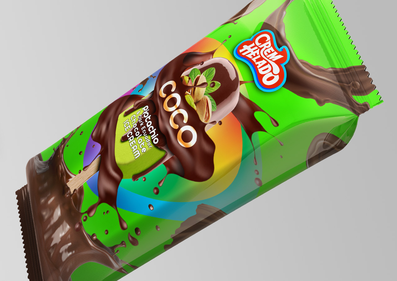
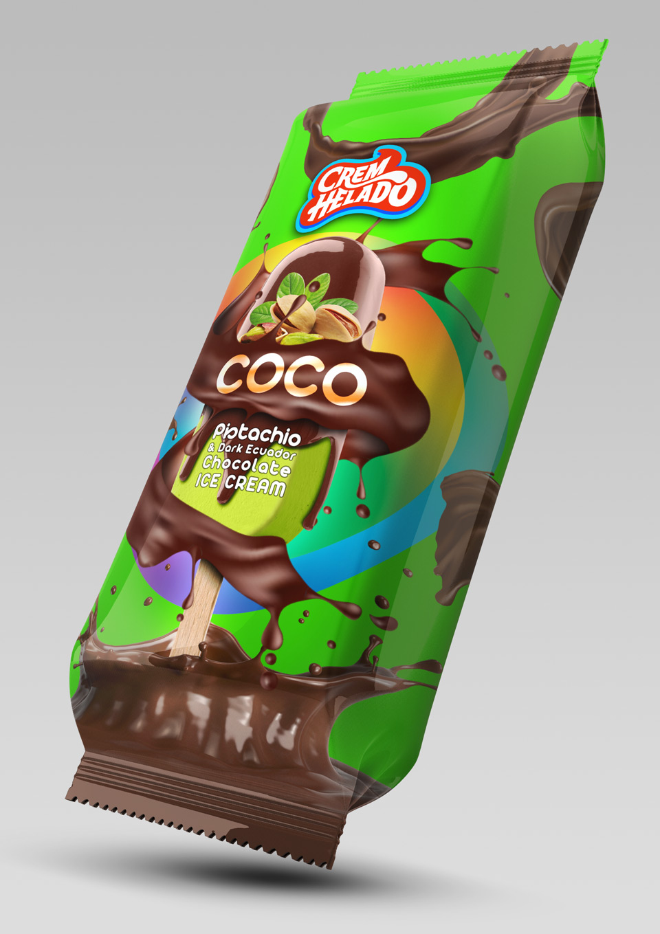
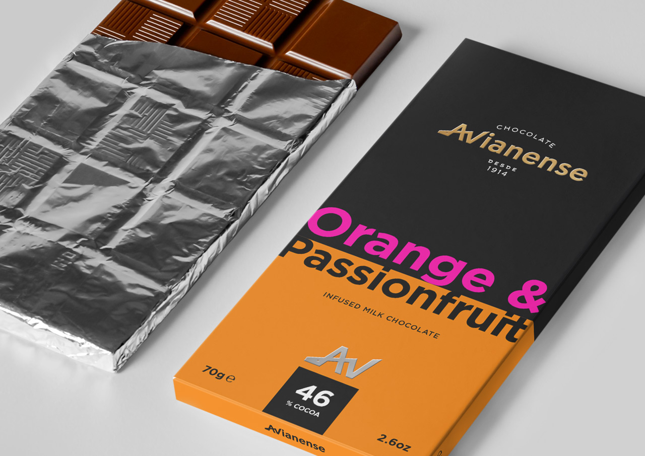
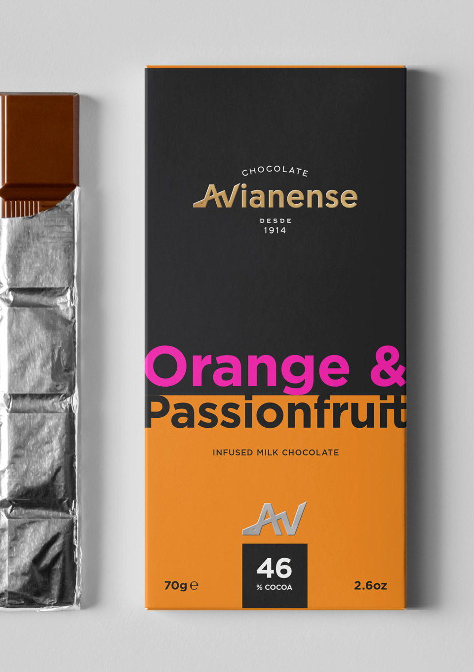
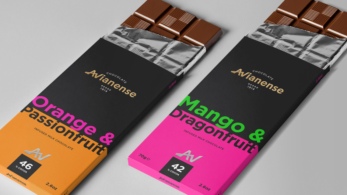
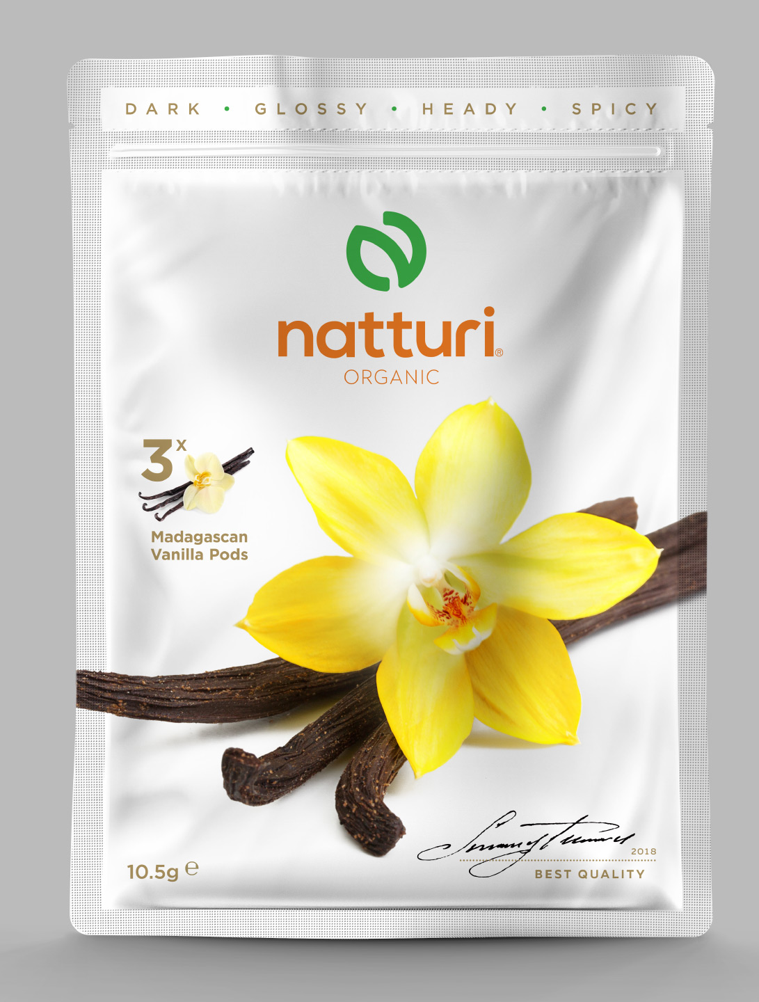
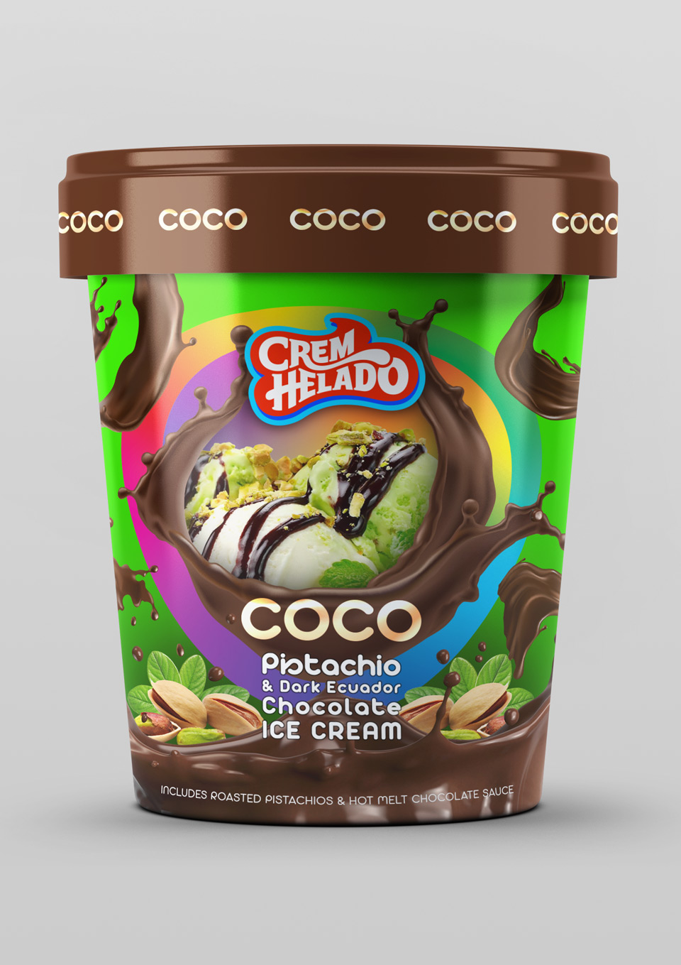
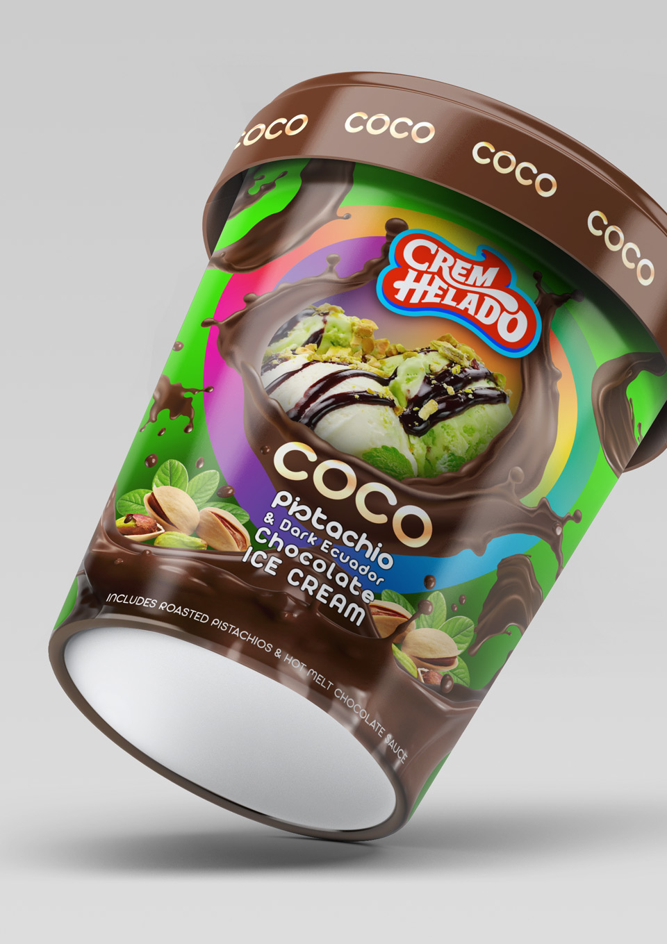
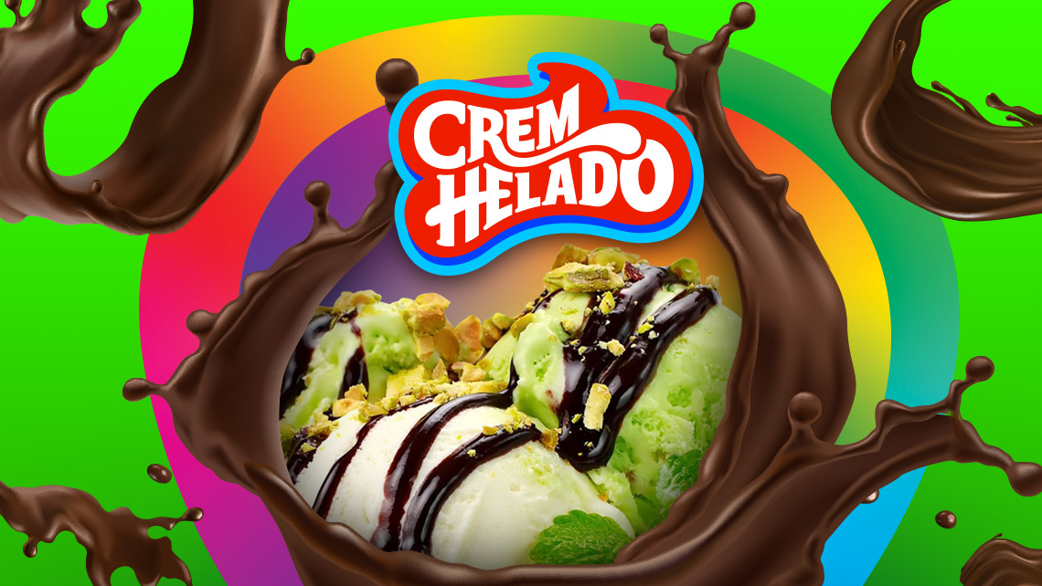
Wine Label Packaging Design
design
Client:
Antares Wine Chile
Project: Wine label design
About: Antares, is the name of the Southern Star, for which this brand of wine is named after, and the concept behind these bottles, I have used a series of photoshopped files to mimic the star in three different situations to depict the different grape varieties. Also created the logo to help boost the brand image, a heavily adapted typographic version of a font. I have also used gold and silver globes to mimic the winning of wine taste awards, which unless carefully viewed, doesn't mean anything, but assists with impulse purchase and gives the product extra weight on shelf.


Pet Food Packaging Design
design
Client: Butchers
Project: Re-brand pet food
About: The ideas behind the re-brand was to challenge the leaders in the feline cat food wars, the name created, although a slang term for a little eater or 'pet name' is actually the name of a breed of cat. The product logo was created with the silhouette of a curled up, contented cat with the little detail of a kitten above the i. The photography used had to be that of a general moggy but was shot in the studio through the various stages of eating, the two above show a contented cat licking his lips after and another longingly looking up at their owner waiting for 'Munchkins'. Inset on the front of each product is an icon of a cat with the strap-line 'PURFECT QUALITY'. The flavour ranges are heavily colour coded.


Chocolate Packaging Design
design
Client: Duc d'O
Project: Redesign Belgian chocolate brand
About: This premium chocolate manufacturer originally had a design that looked a little on the cheap side for the product it contained, the original packaging was in a poor quality recycled stock and literally absorbed light out of the display. So the first thing was to up the quality of the paper and the print and introduce better photography. The final image was uplifted by photoshopping the logo into a 'faux' gold. With the crisp white, matt laminated board box, the packaging now jumps off the shelf in a predominantly dark packaged environment.


Biscuit Packaging Design
design
Client: Crawfords
Project: Traditional biscuit packaging re-design
About: Arrowroot Thins hold a small market sector and sit alongside better known brands of rich tea biscuits and are predominantly eaten by pensioners. The concept attempted to expand the market share by making the product look crisp and fresh by sitting the product alongside colour coded strong continental coffee and an up to date graphic background. The quality and micron level of the packaging film were increased to make the product look a lot better quality.


Product Launch
design
Client: NewTree
Project: Promotional packaging
About: Promotional advent calendar style packaging to promote new chocolate range launched in the UK. The brochure packaging held four different chocolate hits that could be opened through the week. These chocolates contained unusual ingredients and the concept of the hinged advent pockets was to reconnect adults with their childhood memories and produce an extra emotional response when tasting the chocolate. The outer of the packaging was also designed to mimic the full sized bars. I also designed a spoof seed package for one of the ingredients 'lavender' to accompany the package.


Car Wrap Design
design
Client: Osram
Project: Mini car wrap
About: Ok, so not strickly packaging but the principles are similar, this mini was used to promote a new light bulb type, the car was driven around to all the distributors around the UK where they were encouraged to stock and push the new bulb to builders, architects and interior designers. The distributor with the highest sales figures would win the Mini.


Car Wrap Design
design
Client: Keratex
Project: New product launch
About: Keratex needed to launch a new product into the UK market, they had an existing packaging style devised by a previous designer which needed to be followed. The style consisted of the blue band and a secondary aqua colour, as this was Keratex's first foray into food supplements I decided to develop a supplementary colour scheme of magenta and intruduce the sky for all new feed supplements. I also expanded on their current horse image by introducing a sign post stuck into the ground and used the sun as graphic elements to introduce secondary text, whereas it had previously gone over the horse.


If you like what you have seen, then why not get in contact and see how I can help you with your next packaging project.


More packaging design will be uploaded soon, please check back again for regular updates...


AigaDesign CouncilChartered Society of DesignersDesign Business AssociationInternational Society of Typographic Designersicograda
TwitterFacebookLike or follow
Design Intellect
on social media

VIEW PORTFOLIO BY CATEGORY:
Advertising
Brochure Design
Graphic Designer (Testimonials)
Logo Design
Map Design
Marketing
Packaging Design
Web Design
Covering Bristol Bath and Swindon.

Privacy PolicyCV
Copyright © 2003-2013